Introduction
Once the items for a questionnaire have been developed, it is necessary to properly format the questionnaire. This publication reviews important considerations when formatting the questionnaire, such as
- organizing the questions within the questionnaire,
- formatting the layout and visual appearance, and
- pagination.
However, this will only be a brief overview. There are a number of resources that provide in-depth information on developing surveys that may also be useful during the construction phase (Dillman, Smyth, & Christian, 2014; de Leeuw, Hox, & Dillman, 2008; Groves et al., 2009). For specific formatting guidelines, readers may also consult other Savvy Survey Series publications on individual survey modes, including in-person, mail, telephone, online, and mixed-mode surveys.
Moving from Constructing Items to Designing the Questionnaire
It is important to remember throughout the questionnaire development process that a primary goal of a survey is to retrieve complete and accurate information from those being surveyed. One way to accomplish this is through careful construction of the instrument. There are a number of techniques at our disposal to increase the accuracy of information we collect, as well as to reduce the effort needed by respondents to answer the questions.
First, the questionnaire designer must have a clear picture of what information needs to be collected. A questionnaire should have a specific purpose and direction and should focus on collecting very specific information from those being surveyed. One way to focus this process is to use the well-defined objectives established for the survey. Such objectives can be constructed using the program's logic model (see Savvy Survey #5). It is also possible to gather more than one type of information with a questionnaire by using, for example, closed-ended questions with discrete answer categories about behaviors or KASA. However, the question types that are used will differ based on the information that is being sought. For detailed information about item construction, please refer to Savvy Survey publications #6a–6e.
It is crucial to keep in mind that a questionnaire is more than just a random list of questions. Rather, once the items have been constructed, it is important to thoughtfully arrange them into the skeleton of the questionnaire. Each choice the designer makes has the potential to impact nonresponse and measurement biases within the survey, thus affecting analysis and generalizability of the findings after collection has occurred (de Leeuw, Hox, & Dillman, 2008).
Organizing the Questionnaire
According to Dillman et al. (2014), "a questionnaire should be organized much like a conversation" (p. 230). For example, people usually tell stories in a series of chronological statements, which helps to organize the story. Likewise, there needs to be some logical order that directs the survey taker from one question to the next. It becomes difficult for the respondent to provide accurate answers when questions are ordered haphazardly, the focus shifts between topics, and questions are disconnected. However, there are ways to minimize this burden. Below are some common questions that survey designers often ask.
Which questions should go first? Often, it is useful to place items that would be considered interesting or meaningful to the survey taker at the front of the survey in order to generate interest. The first question should "apply to everyone" and "be easy to read, comprehend, and answer" (Dillman et al., 2014, p.230). This question should also obviously reflect the overall purpose of the questionnaire. It is considered a poor practice to start a questionnaire with a long battery of questions in a grid format because this requires more cognitive effort and may cause respondents to quit.
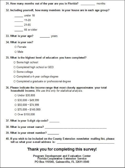
Which questions should go last? Many survey designers save demographic questions until the end of the questionnaire. While these items apply to everyone, are easy to read, comprehend, and answer, these questions might actually be better left until the end of the questionnaire since they do not directly reflect the true purpose of the questionnaire and may hinder gaining survey responses. Instead, asking these items at the end of the questionnaire may actually help the participant finish the questionnaire because, again, these items require little energy to answer.
Also, it is important to place sensitive or potentially objectionable items near the end of the survey. Using this technique encourages continued responses since the survey taker has already spent time answering other more interesting or important questions. Pretesting the questionnaire can help identify which items may be viewed as objectionable or sensitive (for more information on pretesting, see Savvy Survey #8).
How should additional questions be arranged? Remember, the questionnaire should follow some logical order; therefore, items should be grouped together with other questions that cover similar topics. For example, surveys of beef producers in Florida sorted the questions into sections on general farm characteristics, reproduction practices, herd health, nutrition, pasture management, financial management, marketing, and so on. This grouping technique makes it easier for the survey taker to answer in an accurate and reliable way.
Another grouping technique is based on order of events. If the questionnaire includes items that ask the survey taker to recall an event or parts of an event, best practices suggest arranging the questionnaire items by the order or location that the events occurred (Sudman, Bradburn & Schwarz, 1996). For example, if surveying about the quality of a 2-hour workshop, questions about the workshop should be arranged according to the program: introduction, presentation of topic 1, practice of skill 1, presentation of topic 2, practice of skill 2, then conclusion. Using the timeline makes recall easier for the survey taker, which also leads to more reliable responses. A chronological approach can either use a "past to present" or "present to past" timeline, as long as it is consistent throughout the survey.
Formatting the Questionnaire
The order of questions is not the only factor that can make it either easier or more difficult for a survey taker to complete the questionnaire. There are many elements in the layout or format of a questionnaire that can either facilitate or hinder the response process. One important consideration is the way the survey is administered—mail, online, face-to-face, telephone, or mixed-mode. For modes involving paper questionnaires, formatting is heavily influenced by paper size (e.g., letter or legal) and should use a portrait orientation. In contrast, online surveys usually use a landscape orientation to match laptop and desktop computer screens (although surveys on mobile phones typically use a portrait orientation and must accommodate a much smaller screen). After reviewing this publication, interested readers may wish to refer to other Savvy Survey Series publications for mode-specific information on formatting. Below are some common formatting questions that survey designers often ask.
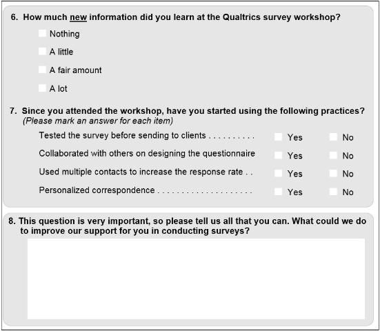
How should the questionnaire look? For mail and web surveys, it is important for the visual presentation of items to be consistent throughout the questionnaire. A consistent presentation makes it clear where and how the survey taker is expected to respond, simplifying the process for those being surveyed. Part of this visual presentation is alignment. By aligning the questions and corresponding answer spaces or categories, the respondents will be able to make sense of the survey's logic as they navigate through the entire document (see questions 6 and 7 in Figure 1).
Another way to help survey takers organize information is through use of color and/or a grayscale contrast. A colored (or grayscale) box can be used to focus the respondent on specific information or highlight the appropriate response areas (see Figure 1). It is also useful to use color or contrast boundaries to visually group related information in regions. For example, question 8 is in a gray area separated from questions 6 and 7 by white space. In online surveys, separate screens can be used to distinguish groups of questions. These tools are most effective if they are used consistently throughout the questionnaire.

In addition to the color and layout, it is also important for text-based cues to be consistent throughout the questionnaire. First, the beginning of each question or section should be clearly identified for the benefit of the survey taker as he or she attempts to navigate through the survey. When starting a new section or topic, it is a good practice to include a transition sentence or a heading to alert the respondent. Including a transition statement, such as "The next few questions ask about ....", helps the respondent to shift gears mentally and begin to access relevant information from his or her memory.
Many times it is appropriate for items to be numbered using a simple, consecutive number pattern. The only time that this may not be useful is within a web-based survey that is using a complex skip-pattern (where the answer to one question determines which question is asked next).
Additionally, typographical elements (e.g., italics, bold, underline) should be used consistently throughout the questionnaire. When used properly, these elements are useful for drawing the survey taker's attention to key words or special instructions. However, switching between these elements in a haphazard or meaningless way just creates confusion.
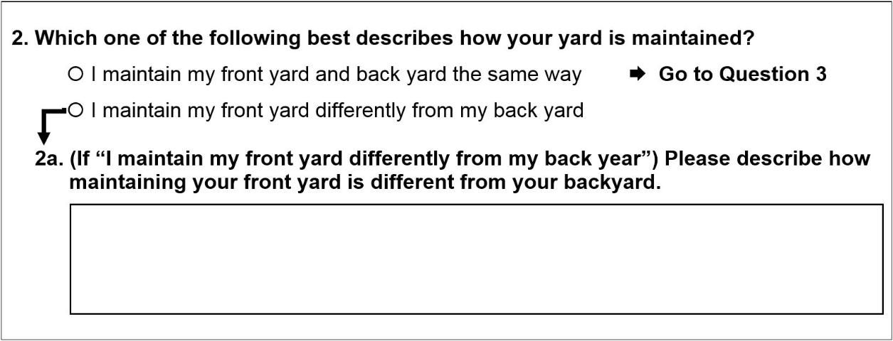
Although directing respondents to the correct question can be automated for web surveys, skipping questions on paper instruments can pose challenges for some respondents. A best practice is to use arrows to "point the way." One strategy for preventing respondents from skipping questions (Redline et al., 2003) uses arrows to guide respondents from their answer to an initial question to that answer's follow-up question (see Figure 2).

How long should the questionnaire be? The number of pages for a questionnaire varies based on the purpose of the survey. Many survey designers find that for self-administered paper methods (e.g., mail or in-person), page counts using multiples of 4 provide the best use of paper resources (i.e., an 11" x 17" piece of paper printed on both sides and folded in half provides 4 pages of questionnaire layout). These can be combined into booklets with 4, 8, 12, or 16 pages for a neat, professional appearance. It is also important when determining the page counts to include both a welcome page and a thank-you and contact page (examples of these items are located in Appendix A and B).
It is also important to recognize that longer questionnaires increase the response burden for the survey taker. Therefore, it is wise to include only items that are directly related to the central focus that was identified early in the survey development process. This will help limit the length of the questionnaire and potentially increase response rates by limiting the time needed to complete the survey. The last thing a survey designer wants is for the survey taker to stop part way through the survey (premature termination).
In Summary
Developing a high quality questionnaire is critical for collecting useful data. Once the items used to collect information have been constructed, it is necessary to properly format the questionnaire. This publication reviewed several important considerations to make when formatting the questionnaire, including the order of the questions, formatting the layout, and pagination. The next publication extends this topic by examining how to pretest the quality of the designed questionnaire.
References
de Leeuw, E. D., Hox, J. J., & Dillman, D. A., (Eds.). (2008). International handbook of survey methodology. New York, NY: Lawrence Erlbaum Associates.
Dillman, D. A., Smyth, J. D., & Christian, L. M. (2014). Internet, phone, mail, and mixed-mode surveys: The tailored design method. (4th ed.). Hoboken, NJ: John Wiley and Sons.
Groves, R. M., Fowler, F. J., Couper, M. P., Lepkowski, J. M., Singer, E., & Tourangeau, T. (2009). Survey methodology (2nd ed.). Hoboken, NJ: Wiley.
Redline, C., Dillman, D. A., Dajani, A. N., & Scaggs, M. A. (2003). Improving navigational performance in U.S. Census 2000 by Altering the Visually Administered Languages of Branching Instructions. Journal of Official Statistics, 19, 4, 403–419.
Sudman, S., Bradburn, N. M., & Schwarz, N. (1996). Thinking about answers: The application of cognitive processes to survey methodology. San Fransisco: Jossey-Bass Publishers.
Appendix A

Appendix B
