This Ask IFAS publication, focusing on the foundations of visual communications, is the third of a four-part EDIS publications series on creating effective visual communications for your local Extension program. This series will include publications on visual communication principles and the development of posters and fliers and computer-generated projected slide presentations.
Any visual communication should be developed with the design principles and elements previously discussed in Visual Communication https://edis.ifas.ufl.edu/WC101. This EDIS publication will discuss the application of those principles to the development of effective displays and exhibits.
Designing Effective Exhibits and Displays
Displays or exhibits are freestanding structures containing many media (photographs, text, illustrations, real objects, video or computer screens) in order to communicate a message to an intended audience. For this publication, the focus will be on simple displays, and the words "display" and "exhibit" will be used interchangeably.
Displays are frequently used in schools. In a display made for a school science fair, for instance, the display tells the story of a student experiment. This may mean using photographs, graphs and charts, text, and possibly a model or some other real object. Exhibits and displays at museums and fairs can be extremely elaborate; some exhibits at fairs can include gardening demonstrations or full-scale petting zoos. Complexity can be an asset in this case, since viewers are free to begin at any part of the exhibit and spend time on the parts of the exhibit that interest them.


Here are some tips to consider when designing your display:
- Determine the purpose of your display. Displays are used in trade shows to help sell products. They also can be used to educate a particular audience about a topic. The purpose must be determined before selecting the media to communicate the message.
- Determine the purpose and content (the message) you want to communicate.
- Consider the actual structure, size, and shape of the display. You will need to know these components in order to design an effective exhibit. Exhibits can be floor-to-ceiling or tabletop in size. Exhibits can come in different shapes, from three-panel designs to curved designs. You can build your own display or have one made for you. Displays can be constructed with foam core (lightweight), corrugated cardboard, plywood paneling, and other materials. Prefabricated exhibits usually cost more, but most come with heavy-duty cases and are built for durability. They can be permanent or temporary.
- If you know you will reuse parts of your display's text or images that are attached to the display, you may wish to have them laminated. It will cost more, but you will be able to use the images or text many times.
- Sketch out the design. Before you print out text or photographs, save yourself some problems by drawing the display on paper. If a display tells a complete story, it should begin at the top left and work to the bottom right, filling in important information along the way. Sketch out this information "flow" on paper before building it. Know how the display will look, work, and be laid out before the construction process begins.
- Determine the layout of text and images. As with the other visual communication methods, in displays it is vital to tell your story visually. You will have content you want to get across to your audience, but do so in a way that minimizes words and maximizes visuals. Images and text must be large. Use big, easily deciphered, bold images. Do not use pixilated images. Choose attractive colors.
- Avoid regular paper (8.5-x-11-inch), if possible. If you have a large enough budget, use a local copy company to print out your text content on larger paper sizes. Some schools and universities may have large printers for you to use. If you are limited to 8.5-by-11-inch paper, make the text large and use multiple pieces of paper to tell your story. Get photos printed on photographic paper or have them developed at a photographic services location in your area. The colors in photographs printed on office paper are usually washed out and difficult to see.
- Determine which media you plan to use. Displays regularly feature printed materials and photographs, but they can also incorporate other media, such as videos and computers. If you use either of these, consider these questions: Will people be able to see the video or computer screens? Will the volume be turned up loud enough for people to hear, and if it is turned up, will the noise interfere with the neighboring booth?
- Decide if you will use a table and, if so, how that will affect the design of the display. If you use a table be sure to place your images and text high enough so that the table does not cover the display's content. Will you include items on the table for people to take away with them (giveaways, brochures, newsletters)? How will the table change the flow of traffic through and around your exhibit?
- Train enthusiastic, helpful people to staff the display. A display rarely tells a complete story. There is no substitute for live human beings who can answer vistors' questions. Choose friendly staff with a genuine interest in your message who will connect with the audience. Remind them to dress professionally.
- Scout the location. In order to design your exhibit, you must consider the location where it will be on display. If possible, scout the location to be sure it meets your needs. If you want to include a television and DVD player, for instance, you will need an electrical outlet within reach. What about lighting? Will your exhibit be in a location that has high traffic flow (people walking by)? Plan ahead so that you can leave enough space in your exhibit for people to walk through. If it looks inconveniently crowded, some potential visitors may pass it by and you may lose part of your audience.
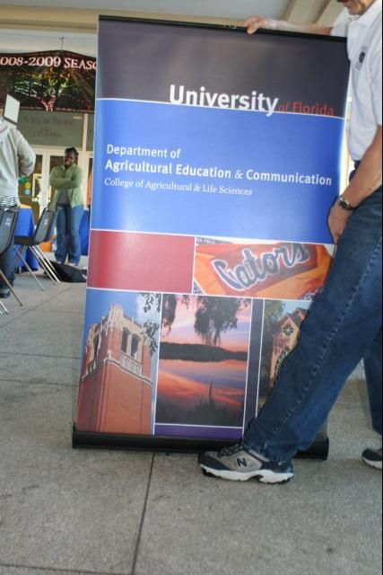
A recent development in display construction is the retractable banner, a long, vertical display that pulls up from a base on the floor and attaches at the top to a long, featherweight pole. Retractable banners are very light and portable, allowing you to make a big visual impact almost without effort. The banners can be expensive, however, so for a temporary display, they might not be the best option. Many organizations have adopted them for displays, or display elements, whose messages will not change—such as a description of the organization.


