Color is the most noticeable and memorable element in the landscape and is usually the focus of most homeowners; however, it is typically a very temporary element, usually lasting only a few weeks a year for individual plants. Color in plant material and in hardscapes adds interest and variety to the landscape and is often used as a focal point. Many homeowners know at least one color they would like to include in their gardens, but they are often unsure which colors to add to create a pleasing color combination.
Color is found in the flowers, foliage, bark, and fruit of plants. Foliage typically provides the overall background color for the flower colors. Green foliage in all its various shades is the dominant color by quantity, but other colors capture attention more readily because of their high contrast to the color green. Color is also found in buildings, rocks, pavers, wood, and furniture. Natural materials, such as stone and wood, typically have muted colors in variations of brown, tan, and pale yellow. Bright colors in the hardscape are also found in man-made materials, such as painted furniture, brightly colored ceramic containers or sculptures, and glass ornaments.
Color has been studied for centuries by some of the leading thinkers in history, including Sir Isaac Newton, who developed the color wheel, and Leonardo da Vinci, who developed color theory to explain the relationship of colors in nature. Color theory can also be used to explain the relationship of the colors on the color wheel and how they should be used in a composition. A variety of color schemes can be developed from the 12 basic colors on the color wheel (Figure 1). The color wheel includes the three primary colors of red, blue, and yellow; the three secondary colors (a mix of two primaries) of green, orange, and violet; and six tertiary colors (a mix of one adjacent primary and secondary color), such as red-orange. An endless number of other colors can be created by adding white, black, or gray to the 12 basic colors or by mixing any of the colors. The three basic color schemes are known as monochromatic, analogous, and complementary.
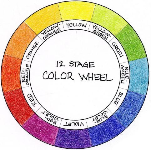
Credit: Gail Hansen, UF/IFAS
Monochromatic Scheme
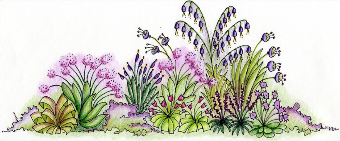
A monochromatic color scheme uses only one color. In landscaping, this usually means one other color besides the green color in the foliage. One color can have many light and dark variations, which can add interest. For example, variations of violet can include lavender, maroon, lilac, and blue-violet (Figure 2).
Credit: Gail Hansen, UF/IFAS
Analogous Scheme
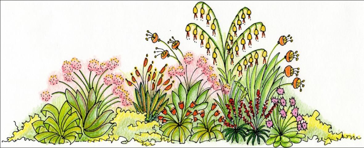
Analogous color schemes include any three to five colors that are adjacent on the color wheel, such as red, red-orange, orange, yellow-orange, and yellow (Figure 3). This scheme also includes the light and dark versions of each color, such as pink, pale yellow, and dark red. The colors are related to each other because they include two primary colors mixed to form a secondary and two tertiary colors, which means they share common properties.
Credit: Gail Hansen, UF/IFAS
Complementary Scheme
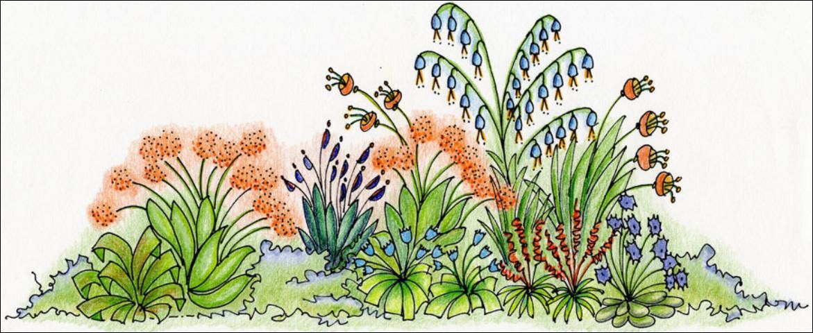
Complementary colors (Figure 4) are those that are opposite each other on the color wheel. They tend to have high contrast between them. The most common sets are violet and yellow, red and green, and blue and orange. Complementary colors are often found naturally in flowers; a common pair is yellow and violet.
Credit: Gail Hansen, UF/IFAS
Properties of Color
Colors have properties that can affect emotions, spatial perception, dominance (focal points), light quality, and balance. One property of color is described relative to temperature—colors appear to be cool or warm and can affect emotions or feelings. Cool colors (blues and purples) tend to be calming and should be used in areas for relaxation and serenity. Warm colors (reds, yellows, and oranges) tend to be more exciting and should be used in areas for entertaining and parties. The "temperature" of colors can also affect the perception of distance and space. Cool colors tend to recede and are perceived as being farther away, making a space feel larger. Warm colors tend to advance and are perceived as being closer, making a space feel smaller.
Color can also be used as a dominant element to capture attention and direct views. Focal points can be created with bright colors. For example, bright yellow, which has the highest intensity (brightness), also has a high contrast with all other colors (often described as a "pop" of color) and should be used sparingly.
Color schemes in the garden can change with the seasons. Summer colors are usually more varied and bright with more flowers, while winter colors tend to be monochromatic and darker with more foliage. Color is also affected by light quality, which changes with the time of day and time of year. Brighter, more intense summer sun makes colors appear more saturated and intense, while the filtered light of winter makes colors appear more subdued. Consideration should be given to the time of day when the area will be used when choosing a color scheme. For example, whites and yellows can brighten a space used primarily in the evening.
Balance can also be achieved with color; a small amount of intense color has as much visual weight as a large amount of a more subdued or weaker color. Because color is temporary, it should be used to highlight more enduring elements, such as texture and form.
Things to Consider When Choosing Color
Choosing colors for the yard can be confusing and a little intimidating simply because there is such a wide variety of color available in plants today. When making color choices, take into account the following:
- Consider the color of the house and other hardscape features. Decide if you want to blend with the building color and extend that color into the yard or if you want to contrast with the color of the house. If most of the plant material is located close to the house, contrast may be a better choice.
- Consider how the yard is used. Frequent parties and entertainment call for bright and lively colors to add energy to the party. Contemplation gardens for relaxation call for cool, soothing colors.
- Consider the time of day and the light conditions in the yard when it is used. Consider light colors if the yard is used in the evening or at night. Light colors usually work better in the shade; darker, brighter colors show better in the sun.
- Consider the garden style. Many historic and recognized garden styles—such as tropical (bright, hot colors), cottage (pastels, spring colors), or contemporary (metallic, unusual colors)—have a characteristic color palette. Although it is not necessary to use the traditional color scheme, doing so would stay true to the style.
- Consider growing conditions and plant availability. Color choices may be limited depending on the plants that will grow best in the yard and the availability of plants in local nurseries.
Finding Color Inspiration
Give careful consideration to your color choices and resist the temptation to buy on impulse. Inspiration can come from different sources. Some possibilities include:
Use your favorite color. Everyone has a color that they find particularly appealing. Most likely it is a familiar color from the past that has meaning—usually on a subconscious level—perhaps a connection with a person, a time, or a place.
Use colors you already have in your house. Chances are you already have color combinations in your home that you find appealing. You can choose to use those same colors in your yard and extend the interior to the outside or try a different theme for variety. If you want to use new colors, it is best to use at least one color from the interior in the new color palette to provide a connection between the spaces.
Use colors from a favorite place or time. Most of us think of our yard as a place to get away from it all. We would like to be transported, if only temporarily, to a place that reminds us of our travels, our childhood home, or a place we would like to visit. This idea has become more popular as people enjoy re-creating a favorite vacation spot in their backyards.
Use colors from a favorite object—a painting, fabric, or a decorative object. Take a tip from interior designers—they often choose a color palette for a room from a painting, a fabric print, or a decorative object. The colors on a favorite piece of clothing might also provide inspiration. The advantage to this method is that the complete color palette has already been established. Visiting art galleries, clothing stores, or home goods stores can provide the opportunity to see a variety of color combinations in a single location. Stores that carry craft supplies and fabrics often carry items with ready-made color combinations, particularly in paper and scrapbook materials.
Use colors from photos in garden magazines and books. People are immediately drawn to color in photographs. In this composition, the contrast makes color distinct and appealing. The advantage of looking for a photo of a landscape to copy is that, like a painting or fabric pattern, the entire color palette has already been established.
Use colors from botanical gardens, plant nurseries, and florists' shops. Gardens and plant nurseries are great places to look for color ideas. In botanical gardens, color combinations have been designed by professionals, and you can observe different color combinations throughout the year. At a plant nursery, you can gather plants in their pots and try different arrangements, adding and subtracting pots to the composition until you get the blend that you want. A florist's shop is also a great place for ideas; professional florists are trained in color theory and the use of color schemes to create floral arrangements. One floral arrangement can be the inspiration for your entire color palette.
Use color ideas from neighborhood yards and community landscapes. As you drive through your neighborhood or community, take note of the landscape colors that catch your eye. Try to determine what it is about the color combination you find appealing. Usually bright, saturated colors will be the first attention-getters simply because of the high contrast. Sometimes these colors can be too intense or artificial looking, but a softer version of the same color might be more appealing. When you look at an attractive yard, note the color of the house also. It may be that the colors look particularly good with the color of that particular house but may not be appropriate for the color of your house.
Testing Color Schemes
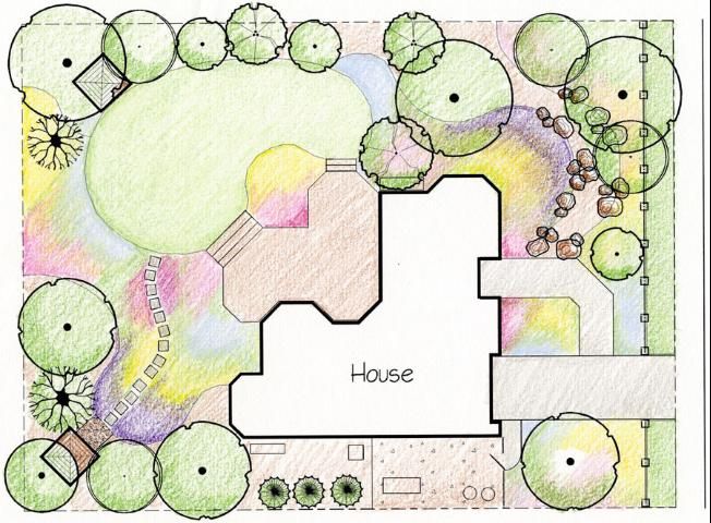
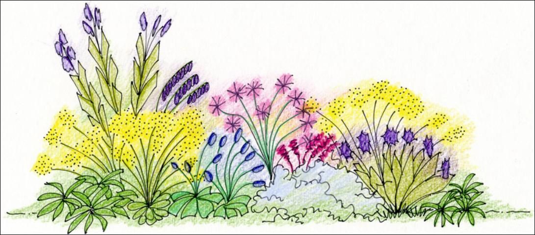
Color studies. Most designers will conduct a color study when laying out the plant material in the design. A simple color study can be done in plan view by using colored pencils to add color where plants will be located (Figure 5). It is also helpful to draw a simple side view (section) of plant materials in a proposed composition and color the plant forms to visualize how the colors will look adjacent to one another (Figure 6).
Credit: Gail Hansen, UF/IFAS
Credit: Gail Hansen, UF/IFAS
Color chips. Use the color wheel to develop a color scheme and then try different variations with color chips. Paint sample cards provide great color chips. Arrange a handful of the cards until you find a combination you like, tape them to a piece of paper, and take it with you when you go to purchase plants or refer to it when you develop your plant list.
Potted plants. If your color area in the yard is small, buy one or two 4 in. pots of a variety of colored annuals and perennials that have a few blossoms on them. Arrange the pots in different color combinations in the area where you intend to plant them until you find one that appeals to you. Set the plants next to the house, hardscape, or other plants to see how the entire composition works together.
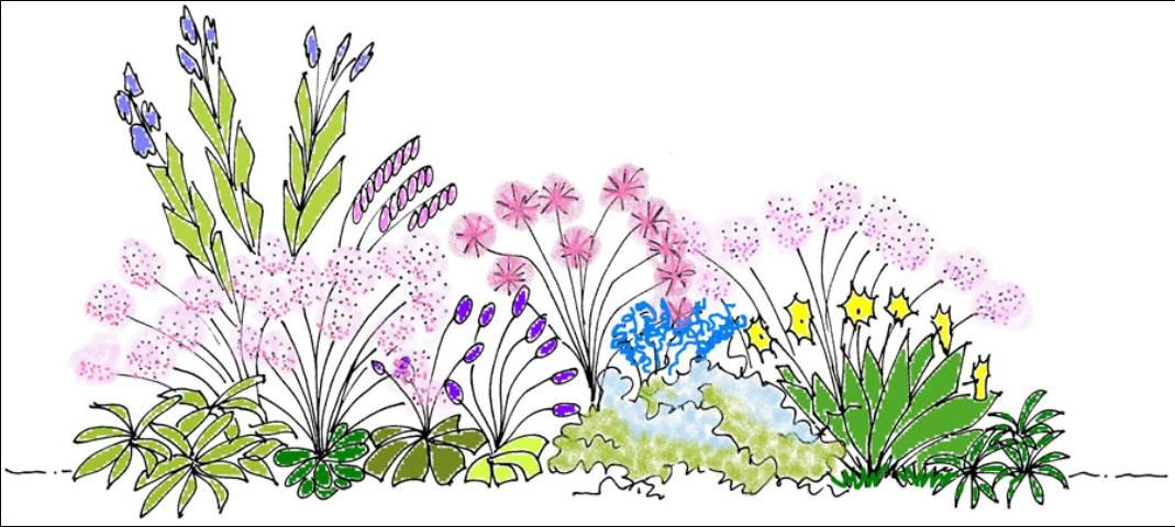
Computer software. You can use simple editing software to test color combinations. Draw a simple sketch of plant material and scan it as a jpeg. Use the Windows Paint program to apply different color combinations (Figure 7).
Credit: Gail Hansen, UF/IFAS
Texture, Form, and Color
One last issue to consider is the temporary nature of color in plants. Because most plants have short bloom periods, don't forget to think about how the plant will look the rest of the year. Consider the texture and form (shape) of the plant and use combinations that will also look good when there is no bloom color present in the plants. Texture, form, and size can affect color. For example, coarse texture, bold form, and large size can often make a color more prominent because the plant is visually prominent. Conversely, color can affect the perception of texture and size. Bold color makes fine texture look coarse and smaller plants look larger. When making design decisions, the best strategy is to start with a color theme because you can almost always find a variety of textures and forms in each of the colors that you want to use.