In nature, plants grow in clusters and drifts, extending to overlap and interlock in layers as they merge with each other. It is helpful to study the composition of natural massings of plants and use similar patterns to arrange plants in a planned landscape. Pattern is produced both with layers and repetition. Plant layers occur vertically with variation in height and horizontally with plant masses along the ground plane. Pattern also occurs through repeated use of plants or through the repetition of a physical characteristic of plants, such as form, color, or texture. When organizing plants, the first step is to create the vertical and horizontal layers and then create a repeating pattern of plants within the garden to visually connect the garden spaces.
Creating Vertical Layers with Plant Material
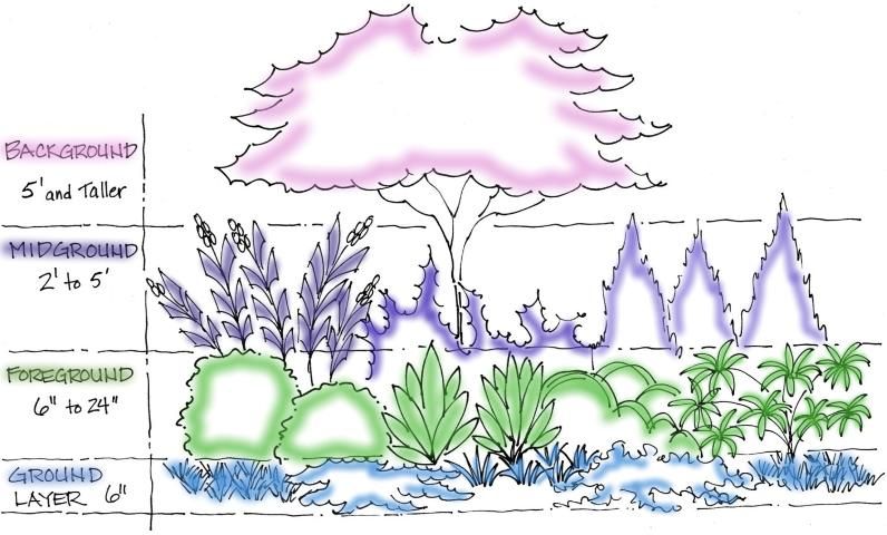
The lowest layer of vertical plants is the ground layer. These are the low plants, including turf, that grow about 6 inches high to cover the bare soil and serve as the baseline of the composition. The foreground layers, plants that are 6 inches to 2 feet, represent the next vertical change from the ground. Small masses of the lowest of these plants form the edge of plant beds and serve as the transition to the larger plants. The midground layer consists of plants from 2 feet to 5 feet. These plants take up most of the space in the composition and serve several functions, including providing spatial definition, linking the lower layer and buildings or tall plants, and creating color and texture throughout the yard. The tallest layer, the background plants, consists of trees and large shrubs that are often used for screens to block views or as canopies for shade (Figure 1). In addition to varying in height from front to back, the height should also vary from side to side along the top of the plant material. The height should undulate from high to low and back to high along the horizon. Try to avoid large gaps in the vertical heights, such as jumping from the foreground layer to the background layer, unless the intent of the design is to have dramatic differences in the layers, a technique that is often used in contemporary design.

Credit: Gail Hansen, UF/IFAS
Creating Horizontal Layers with Plant Material
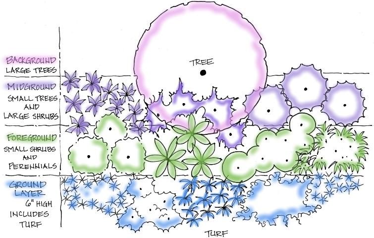
Horizontal layers are the plant masses that overlap and interlock from the front of the plant bed to the back of the bed along the ground plane (Figure 2). The plant masses should vary in depth along the front of the plant bed in the same way that the height varies along the top of the plants. There are two basic rules when arranging plants in the beds: 1) space the individual plants so that they touch each other when they reach their mature size, and 2) overlap the masses of plants and connect them so that they flow without space between them. Avoid gaps or large open areas between masses. Voids attract more attention than the plantings and disrupt the composition. The background or tallest layer is typically located along a fence, wall, or property line, so it is usually best to locate this layer first and work forward to the foreground. Most plant compositions are viewed from one or two vantage points where the ground layer and foreground plants are closest to the viewer, the midground plants are behind the foreground plants, and the background plants are farthest from the viewer. The composition is often more interesting, however, if a few tall plants are added to the foreground or midground layer. It is often helpful to stage the plants in the landscape while they are still in the pots, before planting, to make sure the composition works.

Credit: Gail Hansen, UF/IFAS
Massing Plants within Layers
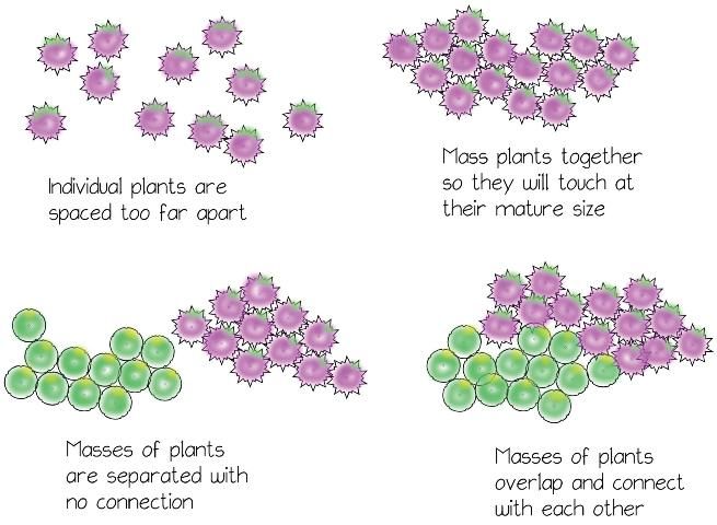
Within the layers, the individual plants are grouped in smaller clusters or masses that connect to each other by overlapping and interconnecting. The pattern is often compared to a jigsaw puzzle, where the masses combine to form a picture. When selecting plants, always consider how it will look in a mass and as an individual plant. Some plants don't blend as well as others and should be used as focal plants. Other plants with a simple form often lack the defining characteristics necessary to stand alone and look better as a large mass, where the size of the mass gives them presence. There are several rules for massing plants to create a cohesive and unified look (Figure 3):

Credit: Gail Hansen, UF/IFAS
- Cluster similar individual plants by planting them close enough so they touch when fully mature.
- Overlap masses of different plants so there is maximum interface between each.
- Vary the shape of the masses. Some should be long and narrow, some short and wide, and some curved, but all should have an organic, rather than geometric, shape unless the design is very formal.
- Use larger masses when using fewer plants and smaller masses when using a greater variety of plants.
- Vary the size of the masses, particularly those that are adjacent. Pair a larger mass with a couple of small masses.
- The size of the plant does not have to dictate the size of the mass. A few large shrubs can create a small mass while many clumping perennials may create a large mass. Depending on the form and texture of the plant, this approach often displays the characteristics of the plant better.
- Use masses of identical size and shape only when flanking both sides of an object or creating symmetry on both sides of an axis in a formal garden.
- Base the size of the massings on the overall size of the site. A small courtyard should have proportionally smaller masses or a few large plants, while a large lot should have larger masses. The viewing distance changes the perception of the size of the masses. It is generally better to increase the size of the masses rather than the number of masses in a large lot to avoid a spotty and chaotic look. Smaller masses with fewer plants work well in a small courtyard because the plants are viewed close up and individual plants stand out more.
Creating Pattern Through Repetition
Linking various areas of the garden through repetition is the basic design principle of rhythm. Repeating colors, forms, or textures of plants throughout the different beds creates a rhythm that is recognized as a pattern in the landscape. See Landscape Design: Aesthetic Characteristics of Plants (https://edis.ifas.ufl.edu/ep433) for more information on color, form, and texture. Rhythm through repetition also contributes to unity, which is another design principal related to the organization of plants. See Basic Principles of Landscape Design (https://edis.ifas.ufl.edu/mg086) for more information about using repetition in the landscape. There are several strategies to create pattern in the garden through placement of plants, including:
- Repeat one distinct form or texture, or two to three colors in selected beds that contrast with simpler forms and textures in the beds.
- Place the plants with the distinct form or texture (focal plants) in locations that will lead the eye around the garden. The most common pattern is a triangle shape between three plant beds.
- Stagger the plants on either side of a pathway in a zigzag pattern to lead the eye forward and draw the viewer into the garden.
Repetition with Form
Form is the most enduring and often most recognizable characteristic of plant material. We identify plant types, such as trees, grasses, or cacti, simply by the silhouette or form. Strong forms have more visual weight, which is the perception of visual importance or the ability to capture attention. Strong forms are usually more upright and often irregular, which contrasts with more horizontal and rounded forms. Some rules for using form include:
- Use one or two strong forms sparingly; repeat in plant beds that are predominantly simple forms with less visual weight.
- Use one dramatic plant as a focal point and emphasize the form by surrounding it with simple forms, but balance it by careful placement of two or three less dramatic focal points.
- Avoid clustering too many strong forms together in a bed; the composition becomes unbalanced with too much emphasis in one place.
- Establish a pattern by repeating one or two of the strong forms in a triangle or other strategic locations throughout the space. Study the views and look for locations along an axis or other areas where the eye naturally goes based on the orientation of the viewer.
- Use texture and color to create strong visual weight in a composition with simple forms.
Repetition with Texture
Texture is created by a combination of the size and shape of the leaves, twigs, and stems with the overall form. Plants have coarse, medium, or fine texture that can change with the viewing distance from the plants, the light quality, and the contrast with surrounding plants. Coarse texture tends to have the strongest visual weight, followed by fine texture in large-scale plants. Too much coarse texture with many different forms can create a chaotic look, and too much fine texture can be monotonous. The key is to create balance in the composition by using one texture, usually coarse, as a focal point and other textures, typically fine and medium, to fill the spaces. However, an interesting and dramatic landscape can be created with all coarse textures if balanced with color and a few different forms. Rules for repetition with texture include:
- Use texture to change the perceived size of a space. Place coarse texture in the background, the tallest layer, to make a space feel smaller, or bring the coarse texture closer to the foreground layer to make a space feel larger.
- Use texture in the background layer to emphasize other plants or garden ornaments. Fine texture in the background makes coarse texture stand out more, and coarse texture in the background makes fine texture look more delicate.
- Note that color can affect the perception of texture. Bold colors tend to look coarser, and muted colors appear to have a medium or fine texture.
- Use one texture throughout the layers to achieve unity. Balance is provided by using a variety of forms or colors.
Repetition with Color
Color is the most temporary characteristic of plant material, yet it is also the one that carries the most visual weight when it is present in the garden. Planning with color is difficult because seasonal changes, light intensity, texture, and color properties and relationships (color theory) must all be considered. A good strategy is to design the entire plan, including the focal points, with form and texture as the first consideration and then use color for additional emphasis if needed. The composition should be balanced and visually pleasing with or without color. Some helpful guidelines for using color include:
- When choosing plants for color and deciding upon location, use a color scheme as a guide. Analogous colors are similar and tend to have a unifying effect. Complementary colors have high contrast, so the amount of color is usually just as important as the location. See Color in the Landscape: Finding Inspiration for a Color Theme (https://edis.ifas.ufl.edu/ep425) for more information about color schemes.
- When locating plants for color, avoid scattering different colors in small clumps or spots throughout the garden. Color should flow through the layers from top to bottom and front to back to avoid lines or clumps of color. Repetition in color comes from the use of a particular color or set of colors more so than the location of the color.
- When using color for a focal point, exercise caution with the color choice if the plant already has high visual value. Color can increase the visual weight of a plant, which can lead to an unbalanced composition.
- When selecting plants for color, consider all parts of the plant, flowers, fruit, bark, and stems as possible sources of color to ensure varying amounts of color throughout the garden year-round. Also keep bloom periods in mind and try to balance the location and amount of color throughout the year.
Key Concepts to Remember
The first step when organizing plants is to create vertical and horizontal layers with a repeating pattern of plants within the layers to visually connect the garden spaces. When arranging individual plants in the beds, space them so that they touch when they reach mature size. This will connect the masses of plants and create a flow without space between them. Repeating colors, forms, or textures of plants throughout different beds creates a recognizable pattern in the landscape.
References
Austin, R. 2002. Elements of Planting Design. New York: John Wiley & Sons.
Bertauski, T. 2005. Designing the Landscape: An Introductory Guide for the Landscape Designer. Upper Saddle River, NJ: Pearson Prentice Hall.
Booth, N. 1990. Basic Elements of Landscape Architectural Design. Prospect Heights, IL: Waveland Press.
Scarfone, S. 2007. Professional Planting Design: An Architectural and Horticultural Approach for Creating Mixed Bed Plantings. New York: John Wiley & Sons.
Thomas, H., and S. Wooster. 2008. The Complete Planting Design Course: Plans and Styles for Every Garden. London: Octopus Publishing Group.
Walker, T. 1991. Planting Design. New York: Van Nostrand Reinhold.