Texture, form, size, and color are the physical characteristics of plants that provide interest, variety, and aesthetic appeal to a landscape. Besides being essential to life on our planet, plants add beauty and charm with their unique forms and color. Physical characteristics give each plant a distinct look and personality. Some plants are extroverts—loud, boisterous, and energetic attention-getters—while other plants are introverts—quiet, calm, and content to be in the background. A good mix of plant personalities creates an interesting and appealing garden.
Some plants may have more value as a visual element in the landscape based on their physical characteristics. The visual value describes the energy or impact of the plant in relation to its surroundings. Some characteristics are more visually dominant and have a higher visual value, some are more functionally dominant, and some dominate simply by size. Upright forms, bright colors, and coarse textures are dramatic and have high visual impact. Low or prostrate forms, dull colors, and fine textures are calm and have low visual impact. The visual value of all plants is dependent on the distance from which they are viewed, the time of year, the quality of light, the adjacent plants, and the plants' health.
Although color usually attracts the most attention, form and texture are more enduring, and they are the characteristics used most often to identify and classify plants. Common plant forms are well established and standardized; most people first recognize a plant by its form. Plant groups with distinctive forms include trees, shrubs, grasses, vines, and palms. Texture is also an enduring characteristic of plants, but it can change temporarily with the seasons, particularly if the plant sheds its foliage in the winter since foliage provides much of the texture.
Each plant must be considered individually when selecting plants for a composition, but the entire composition takes on greater importance than the individual plants. For this reason, it is important to think about how the characteristics of each plant will relate to the plant or hardscape next to it.
Form
Form is the three-dimensional shape of a plant or a plant mass. Overall form is more or less relevant depending on the viewing perspective; for example, the form of a tree can appear quite different when the viewer is standing under the canopy than it does when the viewer is standing in an open field. Plant forms can be divided into three groups—trees, shrubs, and groundcover. Trees are distinguished by their large size, their trunks, and their canopy. Shrubs are typically medium sized and are characterized by a mass of foliage covering the branches. Groundcover is the smallest in size and varies greatly in form, but the distinguishing characteristic is the way the plants are used—to cover the ground—hence the term "groundcover."
Tree Forms
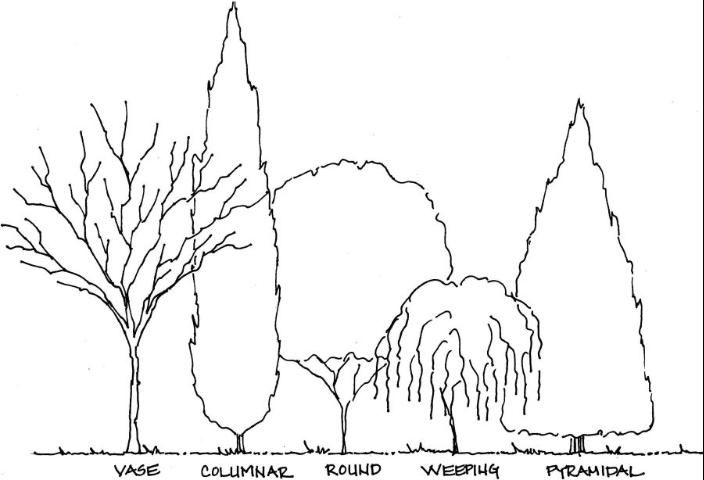
Tree forms are often dominant in the garden because of their size. Trees are also the most functional plants in the landscape, providing shade and blocking views, so when choosing a tree form, consider function first. Creating a shady area in the garden requires a round or oval tree, while a screen usually requires a more columnar or pyramidal form, and a weeping tree form makes a good focal point. It is also important to ensure the tree will not outgrow the space and require severe pruning. Choose the tree for its mature size and shape in relation to the space. Common tree forms include vase, columnar, round, weeping, and pyramidal (Figure 1).
Credit: Gail Hansen
Shrub Forms
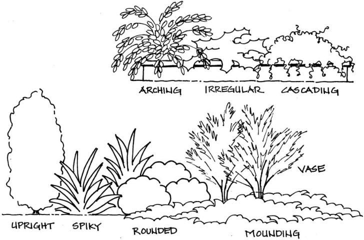
Shrubs have a variety of forms, so it is important to consider how shrubs will look when massed together. Mounding and spreading shrubs look best in a mass, while cascading and spiky forms work well for individual specimen plants. Shrub forms include arching, irregular, cascading, upright, spiky, rounded, mounding, and vase shaped (Figure 2). The form of the shrub determines its most suitable function. Upright, vase, mounded, and round forms work best as taller screens and buffers; irregular and spreading forms work well as groundcovers; and arching, cascading, pyramidal, and spiky forms work best as focal points.
Credit: Gail Hansen
Groundcover Forms
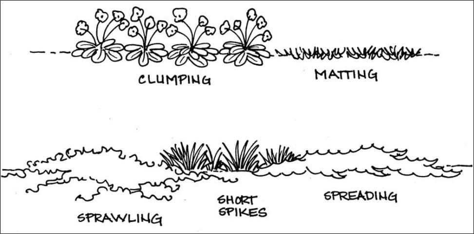
Groundcover or bedding plants tend to have the most complex forms, but they typically look better in masses because they are often small and have little impact as individual plants. Masses of groundcover plants usually lose individual form and look like one plant, so it's important to consider how plants will look as a mass. Groundcover forms include clumping, matting, sprawling, short spikes, and spreading (Figure 3). Matting, spreading, or sprawling plants are used to form a solid, low cover over large areas. Plants that grow in clumps or short spikes can be used in smaller masses and work well in planters or enclosed areas.
Credit: Gail Hansen
Properties of Form
- Forms that have high visual weight include columnar and weeping. Round and vase shapes have medium weight. Horizontal forms, such as spreading and sprawling, have low visual weight.
- Tall, vertical forms draw the eye upward and add height to a space; low, horizontal forms pull the eye along the horizon and add width to a space.
- Plant forms can also create and define the open spaces between the plants. For example, high arching tree branches typically create an open space under the branches for a roomlike feel. A round canopy with low branches fills the space under the tree and closes the space.
- Vertical forms tend to be dominant; therefore, several vertical forms clustered together must be balanced by a greater quantity of horizontal forms, which act as the link to tie the vertical forms together.
Strategies for Using Form
Following are several strategies for using form effectively in the landscape:
- Choose the form that best fits the space where the plant will be located. Form is also closely related to size. A tall, narrow plant should be used in a narrow space, and a wide, spreading plant can be used to cover a large space.
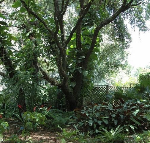
- Choose form based on the function of the plant. A tree needed for shade should have a vase shape with a wide, spreading canopy (Figure 4), and a shrub needed as a screen should have a dense, upright form.
Credit: Center for Landscape Conservation and Ecology
3. Consider the form of adjacent plants. For variety, choose plants that contrast with strikingly different forms; for example, place a spiky form next to a soft, mounding form. Figure 5 shows a container with a combination of shrub and groundcover forms, including arching, spiky, cascading, sprawling, and clumping plants.
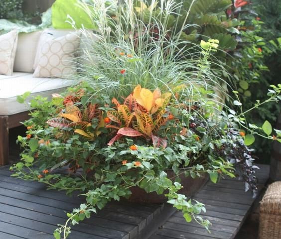
Credit: Center for Landscape Conservation and Ecology
4. Repeat a few forms in the landscape to create a unified design. Too many forms create a disorganized look that lacks cohesion.
5. Keep in mind that too many complex forms tend to look chaotic, and too many simple forms can be boring.
6. Choose one or two strikingly different forms for contrast as a focal point; the rest of the forms should be neutral to blend well.
7. Remember that vertical forms can block views, and low, horizontal forms can open views.
8. Emphasize form in a simple color scheme.
9. Establish the bulk of the composition using natural plant forms, rather than overtrimmed forms.
A simple form study (Figure 6) can be used to determine how different combinations of forms create balance and fill spaces. Plants are drawn in a simple outline to focus on shape and arrangement. Form studies are also useful when locating forms for functions, such as blocking views or creating shade. For example, to determine if the form is adequate to block the view from a window, draw the plant, to scale, in front of a scale drawing of the wall and windows.
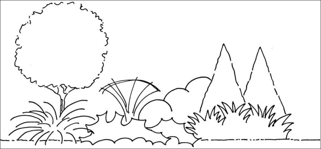
Credit: Gail Hansen
Texture
Texture refers to how coarse or fine the overall surface and individual leaves of the plant feel or look (perceived visual texture). Like form, a variety of textures provides interest and contrast in the landscape. Texture can be found in the foliage, flowers, blades, and bark of the plant, as well as in the plant's overall branching pattern. The size and shape of the leaves most often determines the perceived texture of the plant. A plant can generally be described as having a coarse, medium, or fine texture (Figure 7). Coarse texture is more dominant than fine and tends to stand out individually, while fine texture is more subordinate and tends to unify compositions.
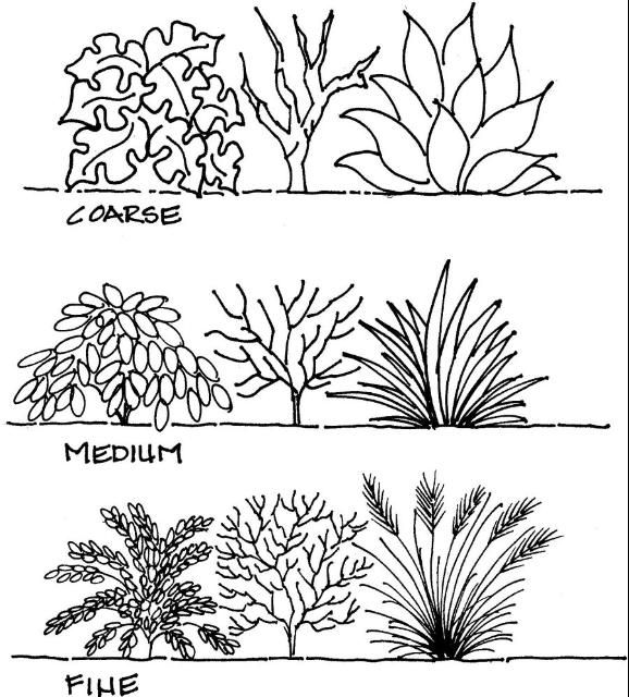
Credit: Gail Hansen
Coarse Texture
Plant characteristics that create coarse texture include thick twigs and branches; leaves and twigs with spines or thorns; large leaves; leaves with very irregular edges and/or bold, deep veins; variegated colors; and bold or irregular forms (Figure 8). With their high contrast, coarse-textured plants attract the eye and tend to hold it because the light and dark contrasts of the shadows provide more interest. Each leaf of a coarse-textured plant breaks up the outline, giving the plant a looser form. Examples of plants with coarse texture include philodendron, agave, bromeliad, holly, palm, and hydrangea.
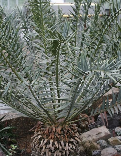
Credit: Center for Landscape Conservation and Ecology
Medium Texture
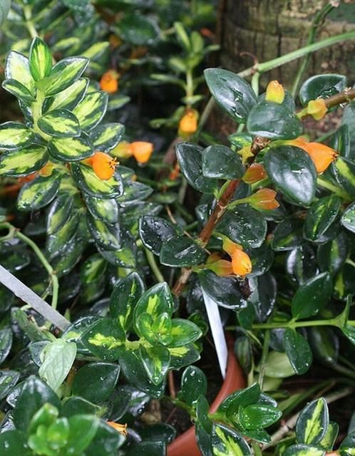
Medium-textured plants have foliage and branches that are neither overly large nor small and delicate; most plants fall in this category. They are characterized by medium-sized leaves with simple shapes and smooth edges (Figure 9). The average-sized branches are not densely spaced nor widely spaced, and the overall form is typically rounded or mounding. Medium-textured plants act as a background to link and unify the coarse- and fine-textured plants. Plants with medium texture include agapanthus, camellia, euonymus, pittosporum, and viburnum.
Credit: Center for Landscape Conservation and Ecology
Fine Texture
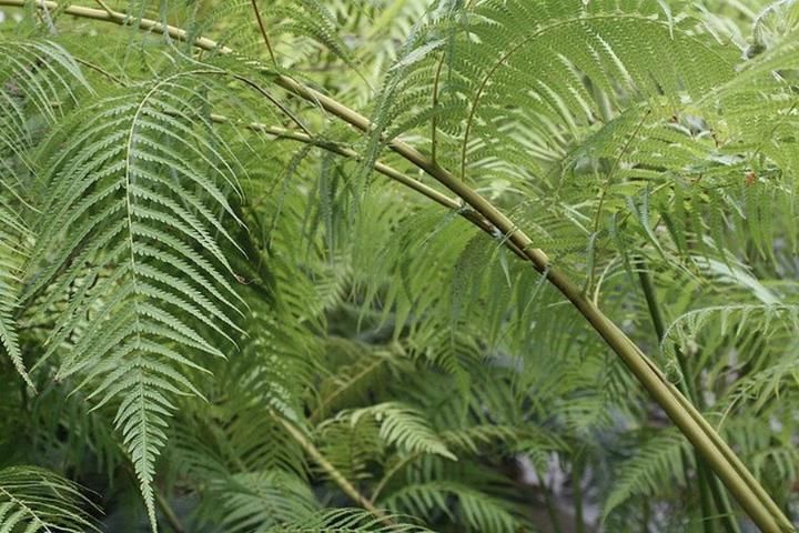
Characteristics that create fine texture include small, delicate foliage; thin, strappy leaves (grasses); tall, thin stems; small, fragile twigs with many branches; narrow trunks; long stems (vines); and small, delicate flowers. They are often described as wispy and light or with a sprawling, vining form. Fine-textured plants can sometimes have a stronger form because the small individual leaves are densely packed (e.g., boxwoods) to create a solid form. Plants with a fine texture include grasses, ferns (Figure 10), Japanese maples, vines, and junipers with fine needles.
Credit: Center for Landscape Conservation and Ecology
Properties of Texture
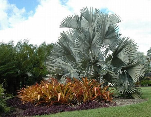
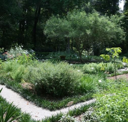
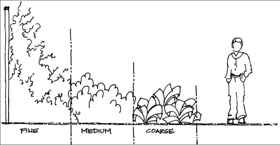
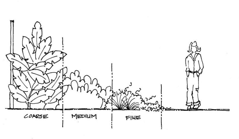
Coarse textures have high visual weight, and fine textures have low visual weight. Figures 11 and 12 show the contrast between a visually dominant landscape with all coarse texture and a less visually strong landscape with all fine texture.
Credit: Center for Landscape Conservation and Ecology
Credit: Center for Landscape Conservation and Ecology
- High color contrast can highlight texture contrast and make plants appear to have coarser texture.
- The texture of a plant can depend on its surroundings. A medium-textured plant can look coarse when surrounded by fine-textured plants or fine when surrounded by coarse-textured plants.
- Texture changes with the seasons when plants lose their foliage or produce large fruit or flowers.
- Texture can vary with the size of the plant, the form, and the density of the foliage.
- The perceived texture of plants can also change with the distance from the plant. Plants that are coarse close up can look fine textured from a distance.
- Bold colors increase the contrast and make any texture appear coarser, while muted colors can flatten texture.
- Hardscape with a coarse texture—such as very rough rocks and bold, large timbers—tends to make all plant material appear more medium in texture by contrast.
- Plant texture is less important and tends to blend if the texture of other garden elements is more prominent.
- Texture affects the perception of distance and scale. To make a space feel larger, locate plants so that the fine textures are along the outer perimeter, the medium textures are in the middle, and the coarse textures are closest to the viewer (Figure 13). The small size of the fine texture recedes in the landscape and is perceived as being farther away.
- To make a space feel smaller, place the coarse textures along the outer perimeter and the fine textures closest to the viewer (Figure 14). The detail of the coarse texture makes the plants appear to be closer, and the space feels smaller.
Credit: Gail Hansen
Credit: Gail Hansen
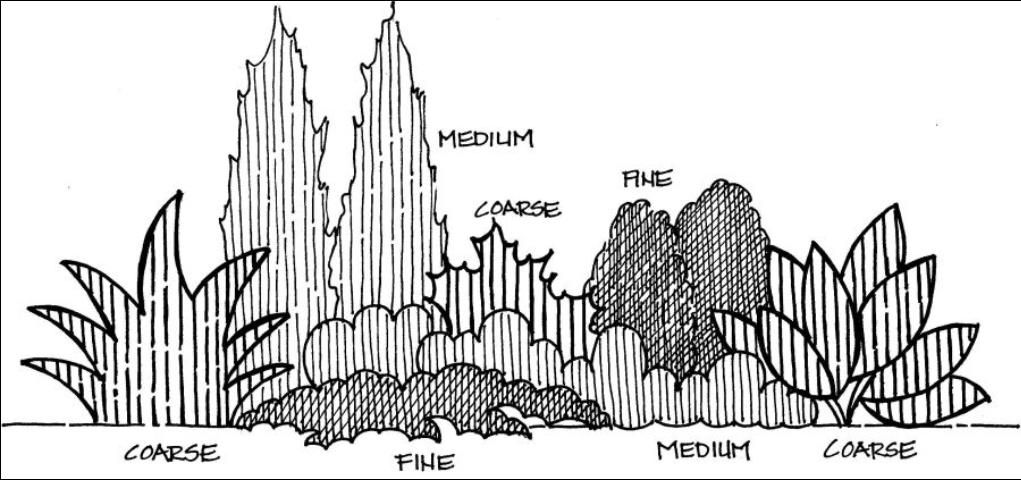
Designers often develop a texture study (Figure 15) on paper to help decide the arrangement of plant materials. The drawing mimics texture by using different line weights and spacing to represent fine, medium, and coarse textures.
Credit: Gail Hansen
Strategies for Using Texture
Following are several strategies for using texture effectively in the landscape:
- Mix textures for a balance of all three—coarse, medium, and fine.
- Use all of the same texture (monotexture) if you want to emphasize the form or color of the plants.
- Choose one texture as the dominant texture; add just a few plants of the other texture for specimen plants and contrast. Use the dominant texture throughout the composition.
- Use texture and color together to emphasize plants.
Size
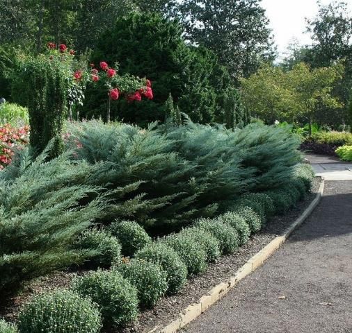
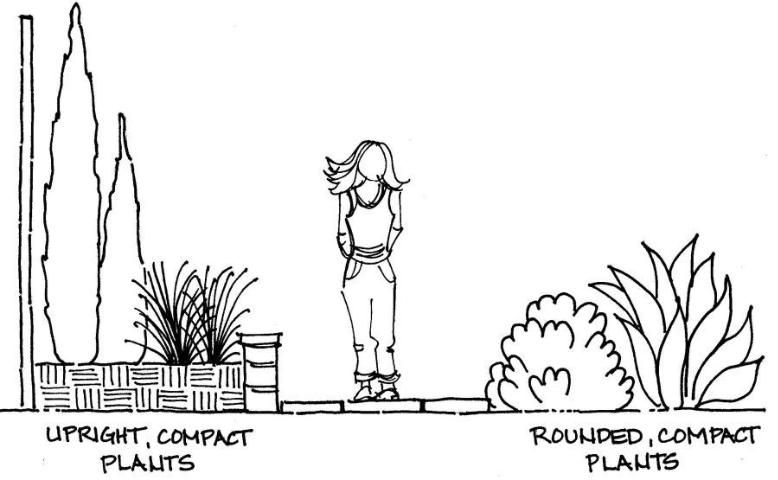
Size refers to the overall height and width of the plant and its relative size or scale when compared to other plants, structures, and spaces in the yard. Plants are most often sized by height. Large plants are trees and shrubs that grow 4–6 ft. or higher at mature size. Medium plants, typically shrubs, range from 2–4 ft. in height. Small plants, typically groundcover and bedding plants, are 2 ft. tall or shorter. Plant size is closely related to form. Columnar, pyramidal, and upright plants are narrow and occupy less horizontal space, while sprawling, arching, and mounding plants tend to use less vertical space. Locations that require consideration of size include overhead utility lines, underground water and electrical (no large trees), building height, windows and doors, and architectural features, such as arbors and archways. Spaces that require size consideration include planters, plant beds, and containers, particularly next to the walkway (Figure 16) and house.
Credit: Center for Landscape Conservation and Ecology
Properties of Size
- Size can affect spatial feeling. Large plants can make a space feel larger.
- Large plants tend to be dominant features.
- Plant size determines function. Trees are used for overhead shade, shrubs for screens, and groundcover for large ground areas.
- Size is the most effective characteristic of plants that are used to create spatial organization in the garden.
Strategies for Using Size
Following are several strategies for using size effectively in the landscape:
- Choose the size that best fits the location (Figure 17).
- Choose the size that best fits the space.
- Use a tall, narrow plant in a narrow space and a wide, spreading plant in a large space. Size is closely related to form.
- Choose size based on the function of the plant. A tree that is needed for shade should have a wide, spreading canopy, and a shrub that is needed for privacy should be tall and wide.
- Keep the plants proportional to the house, the lot, and the other plants.
- Interconnect and overlap plant heights, but avoid obvious layers of low, medium, and high plants.
- Vary the sizes of plants, particularly the height, for more complexity and interest.
- Give plants room to grow. Remember the mature size of the plant and space plants for that size.
- Leave a gap (about 2 ft.) between the house and plant material for air circulation and maintenance. Locate foundation plants to maintain the gap at the mature size.
- Keep in mind that even though larger plants are typically more expensive, they cover more area and fill in a space more quickly than smaller plants.
- Keep in mind that even though smaller plants tend to be less expensive, filling a space with them requires more plants and more time than larger plants.
- Remember that very large plants can make a medium-sized plant look small by comparison, and small plants will be hardly noticeable.
Credit: Gail Hansen
Color
Color is the characteristic that most people notice first in a landscape, and it is also the characteristic by which most people select plants. However, designs based on color often fail because color is fleeting. Choosing a color theme requires an understanding of the properties of color and the basics of color theory. To learn more about choosing a color theme for the landscape, see Color in the Landscape: Finding Inspiration for a Color Theme (https://edis.ifas.ufl.edu/ep425). A color theme is the overall color pattern of the entire landscape. For example, an analogous theme is made up of colors adjacent to each other on the color wheel and might include the colors from yellow to red. This means there are many considerations when choosing individual plants to stay true to the red to yellow palette. This is true for all the various color themes used in the landscape.
Properties of Color
- The changing conditions of outdoor light change the appearance of color. Colors appear more saturated in summer sun and more subdued in winter light. Colors are also brighter in morning sun and deeper in evening light.
- Colors affect emotions. Some are considered warm (red, orange, and yellow) and high energy, or cool (blue, green, and violet) and calming and soothing.
- Adding black or white to a color changes the value, which is the lightness or darkness of the color.
- Bright, pure pigments have a high intensity or saturation. Mixed pigments have a lower saturation or intensity. Colors with weak intensity have low visual impact, and colors with high intensity have high visual impact.
- Surrounding colors affect intensity. Grouping many high-intensity colors reduces the intensity of each color because the colors compete.
Strategies for Using Color
Following are several strategies for using color effectively in the landscape:
- Consider the amount of color in each plant. Some plants have large, showy flowers or big, dramatic leaves with color. Other plants have tiny flowers but might make up for size by having masses of blooms.
- Consider the length of bloom for the flowers. Annuals may bloom all season, while perennials could vary from several months to one or two short weeks.
- Consider the seasonal timing of the color. Plan for a sequence of flowering color throughout the year for year-round color.
- Use a color theme to guide color selection. A simple theme uses only two or three colors.
- Use large drifts of color rather than random spots of color.
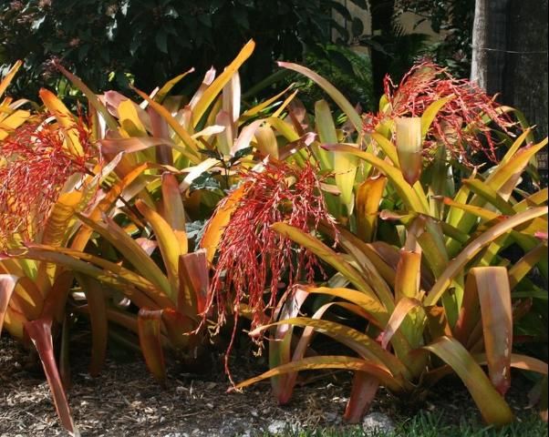
- Use fruit, foliage, and branches as a source of color (Figure 18). Flowers may give more color in the spring and summer, but fruit and foliage often provide fall color.
- Look for foliage with variegated stripes and mottling to add color.
- Keep in mind that bright color makes small plants look bigger and coarser in texture.
- Use the least amount of the brightest color and balance with a larger amount of more subdued colors. For example, bright yellow is a very intense color, so use a small amount with a larger amount of darker purple for balance.
- Use a neutral color to link other colors. Neutral colors are more subdued and typically created by adding white, gray, or black. Light pink is an example of a neutral color that links saturated red and red-orange.
Credit: Center for Landscape Conservation and Ecology
Choosing Plant Combinations
Before choosing plants, consider your design theme and the types of plants that are characteristic of the theme. The theme will help identify the feel that you want in the space. For example, a tropical theme might have more extroverts—bold, coarse, and energetic plants—while a contemplation garden might have many more introverts—quiet, calm plants. A composition of plant material works the same way a painting composition works. Features are arranged to create a dominant area that is the focal point, and the rest of the composition serves as the background.
When choosing plants for the composition, consider form and size first, then texture, and finally color. Consider the space where the plant will be located and note the following: size of the space, color of the walls and hardscape, texture of the hardscape, and surrounding views. Always remember to consider the size of the plants at maturity and provide ample space for growth.
References
Austin, R. 2002. Elements of planting design. New York: John Wiley & Sons.
Bertauski, T. 2005. Designing the landscape: An introductory guide for the landscape designer. Upper Saddle River, NJ: Pearson Prentice Hall.
Thomas, H., and S. Wooster. 2008. The complete planting design course: Plans and styles for every garden. London: Octopus Publishing Group.
Scarfone, S. 2007. Professional planting design: An architectural and horticultural approach for creating mixed bed plantings. New York: John Wiley & Sons.