Landscape designers work on a canvas that is distinctly different from other art forms. The "art" is always changing as the plants grow, environmental conditions change, and people use the space. For this reason, landscape designers use a design process that systematically considers all aspects of the land, the environment, the growing plants, and the needs of the user to ensure a visually pleasing, functional, and ecologically healthy design.
Elements and Principles
The design process begins by determining the needs and desires of the user and the conditions of the site. With this information, the designer then organizes the plants and hardscape materials, which are collectively referred to as the features. The features can be physically described by the visual qualities of line, form, color, texture, and visual weight—the elements of design. The principles are the fundamental concepts of composition—proportion, order, repetition, and unity—that serve as guidelines to arrange or organize the features to create an aesthetically pleasing or beautiful landscape.
Knowledge of the elements and principles of design is essential to designing a landscape and working through the design process. This publication describes each of the elements and explains the principles and their application.
Elements of Design
The elements of composition are the visual qualities that people see and respond to when viewing a space. Visual qualities can illicit many different emotions and feelings, and the more positive those feelings, the more likely people are to enjoy and use a space. Perhaps the most common element in a composition is line. Line creates all forms and patterns and can be used in a variety of ways in the landscape.
Line
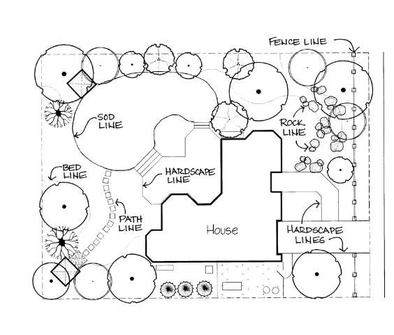
Line in the landscape is created by the edge between two materials, the outline or silhouette of a form, or a long linear feature. Lines are a powerful tool for the designer because they can be used to create an infinite variety of shapes and forms, and they control movement of the eye and the body. Landscape designers use lines to create patterns, develop spaces, create forms, control movement, establish dominance, and create a cohesive theme in a landscape. Landscape lines are created several ways: when two different materials meet on the ground plane, such as the edge of a brick patio meeting an expanse of green turf; or when the edge of an object is visible or contrasts with a background, such as the outline of a tree against the sky; or by the placement of a material in a line, such as a fence. Figure 1 shows common landscape lines, including bedlines, hardscape lines, path lines, sod lines, and fence lines. Lines can have one or more characteristics, such as those described below, but they typically serve different purposes.
Properties of Lines
The properties of lines determine how people respond to the landscape, both emotionally and physically.
Straight Lines
Straight lines are structural and forceful; they create a formal character, are usually associated with a symmetrical design, and lead the eye directly to a focal point. Diagonal lines are straight lines with an intentional direction. Straight lines are most often found in hardscape edges and material.
Curved Lines
Curved lines create an informal, natural, relaxed character that is associated more with nature and asymmetrical balance. Curved lines move the eye at a slower pace and add mystery to the space by creating hidden views.
Vertical Lines
Vertical lines move the eye up, making a space feel larger. An upward line can emphasize a feature and has a feeling of activity or movement. Vertical lines in the landscape include tall, narrow plant material, such as trees, or tall structures, such as an arbor or a bird house on a pole.
Hortizontal Lines
Horizontal lines move the eye along the ground plane and can make a space feel larger. Low lines are more subdued and create a feeling of rest or repose. Horizontal lines can spatially divide a space or tie a space together. Low lines are created by low garden walls, walkways, and short hedges.
Lines are used to draw forms on a plan. In plan view, they define plant beds and hardscape areas. Lines are also created by the vertical forms of built features and plant material. There are three primary line types that create form in the landscape: bedlines, hardscape lines, and plant lines. Bedlines are created where the edge of the plant bed meets another surface material, such as turf, groundcover, gravel, or patio pavers. Bedlines connect plant material to the house and hardscape because the eye follows the line, moving the gaze through the landscape. Hardscape lines are created by the edge of the hardscape, which delineates the built structure. Line can also be created by long and narrow materials, such as a fence or wall.
Form
Shape is created by an outline that encloses a space, and form is the three-dimensional mass of that shape. Form is found in both hardscape and plants, and it is typically the dominant visual element that spatially organizes the landscape and often determines the style of the garden. The form of structures, plant beds, and garden ornaments also determines the overall form theme of the garden. Formal, geometric forms include circles, squares, and polygons. Informal, naturalistic forms include meandering lines, organic edges, and fragmented edges. Plants create form in the garden through their outlines or silhouettes, but form can also be defined by a void or negative space between plants.
Geometric Forms
Circular Form
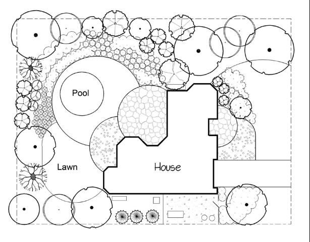
Circles can be full circles, or they can be divided into half circles or circle segments and combined with lines to create arcs and tangents. Figure 2 shows the use of circle segments for hardscape and lawn panels. Circles can also be stretched into ovals and ellipses for more variety and interest. Circles are a strong design form because the eye is always drawn to the center, which can be used to emphasize a focal point or connect other forms.
Square Form
Squares are used for a variety of features, including stepping stones, bricks, tiles, and timber structures, because they are an easy form to work with for construction. The square form can also be segmented and used repeatedly to create a grid pattern. Unlike circles, squares are stronger on the edges, which can be lined up or overlapped to create unique patterns and more complex forms.
Irregular Polygons
Polygons are many-sided forms with straight edges. Triangles, for example, are three-sided polygons. The angled edges of polygons can make interesting shapes, but they should be used cautiously because the forms can become complex; simplicity is best.
Naturalistic Forms
Meandering Lines
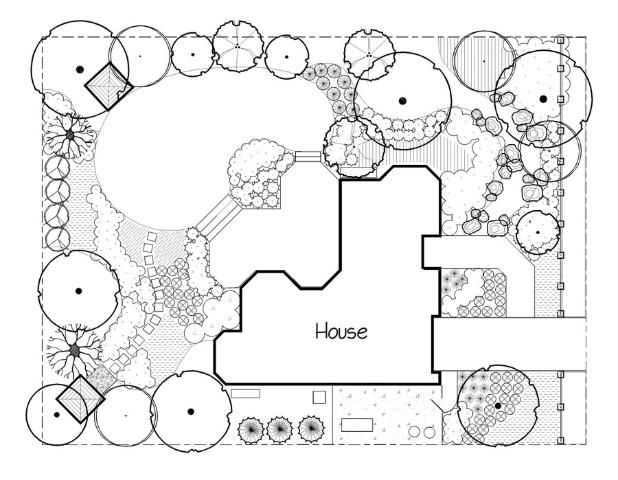
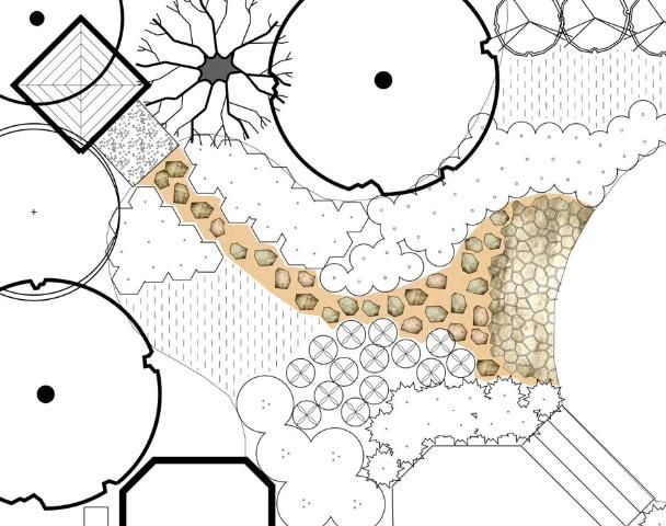
Meandering lines often mimic the natural course of rivers or streams and can be described as smooth lines with deeply curved undulations. Meandering lines (Figure 3) work well for pathways, plant bedlines, and dry stream beds. Meandering lines can add interest and mystery to a garden by leading viewers around corners to discover new views and spaces.
Organic Edges
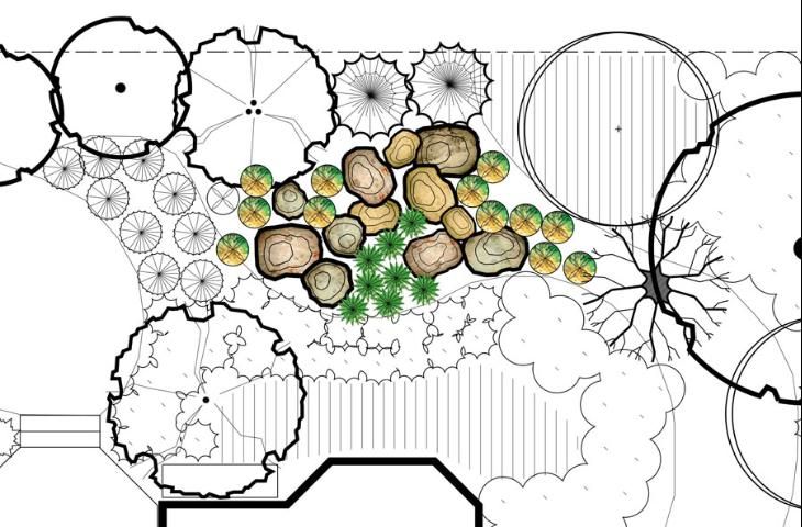
Organic edges mimic the edges of natural material, such as foliage, plant forms, and rocks, and can be described as rough and irregular. Organic lines can be found in rock gardens and along dry creek beds or purposely created on hardscape edges.
Fragmented Edges
Fragmented edges resemble broken pieces scattered from the edge, such as stones or pavers, and are often used to create a gradually disappearing edge on patios or walkways.
Plant Forms
Form is the most enduring quality of a plant. Common plant forms are well established and standardized, as form is the most consistent and recognizable characteristic of plants. Form can also be created through the massing of plants, where the overall mass creates a different form than an individual plant. A strong form that contrasts with the rest of the composition will have greater emphasis within the composition. A highly contrasting form must be used with care—one or two work well as a focal point, but too many create chaos. Natural plant forms, rather than over-trimmed forms, should establish the bulk of the composition. The relevance of overall form is more or less dependent on the viewing perspective—the form of a tree can appear quite different to a person standing under the canopy versus viewing the tree from a distance in an open field. Vertical forms add height; horizontal forms add width. Plant forms also create and define the void or open spaces between the plants, creating either convex or concave forms in the voids. High-arching tree branches typically create a concave open space under the branches, and a round canopy with low branches fills the space to create a convex form in the open space under the tree.
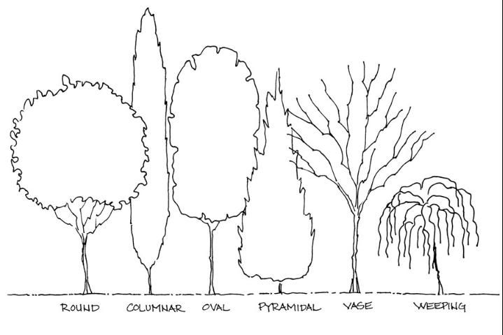
Tree Forms
Common tree forms (Figure 6) include round, columnar, oval, pyramidal, vase shaped, and weeping. Different tree forms are used for visual appeal, but the form is also important for function. Creating a shady area in the garden requires a round or oval tree, while a screen usually requires a more columnar or pyramidal form, and a weeping tree form makes a good focal point.
Shrub Forms
Shrub forms (Figure 7) include upright, vase shaped, arching, mounding, rounded, spiky, cascading, and irregular. Choosing shrub forms often depends on whether the shrub will be used in a mass or as a single specimen. Mounding and spreading shrubs look best in a mass, and cascading and vase-shaped shrubs do well as specimen plants.
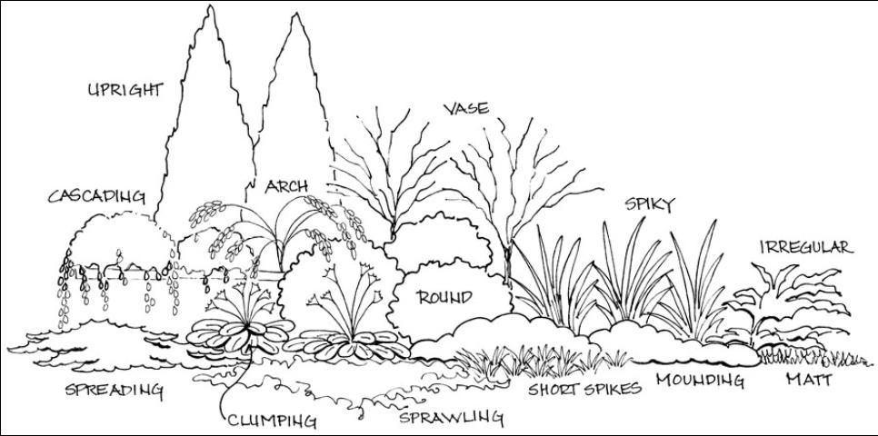
Groundcover Forms
Groundcover forms (Figure 7) include matting, spreading, clumping, sprawling, and short spikes. Almost all groundcovers look better in masses because they are typically small, ground-hugging plants that have very little impact as individual plants.
Properties of Form
Form is very powerful because people can often recognize and identify a feature based on an outline or silhouette. People can often perceive a form when only a portion of it is visible. Familiarity and the suggestion of a form is enough for the eye to fill in the rest. Repetition of form is essential to the creation of pattern, which is the basic organizational structure of the landscape.
Form is also the primary determinant of a formal or informal garden. Geometric forms with straight edges are typical of formal gardens that are based on an established style, such as contemporary or Italian gardens. An informal garden has more naturalistic, organic forms that are normally found in gardens that mimic nature. Form compatibility is also a major component of unity in design—one or two strikingly different forms are good for contrast and emphasis, but generally all other forms should have some similarities for a unified look.
Texture
Texture refers to how coarse or fine the surface of the plant or hardscape material feels and/or looks. Texture is used to provide variety, interest, and contrast. The plant's foliage, flowers, bark, and overall branching pattern all have texture. The size and shape of the leaves often determines the perceived texture of the plant. A plant can generally be described as having a coarse, medium, or fine texture. Coarse texture is more dominant than fine and also tends to dominate color and form, while fine texture is more subordinate to other qualities and tends to unify compositions. Coarse-textured plants attract the eye and tend to hold it because the light and dark contrasts of the shadows provide more interest. Fine texture exaggerates distance and gives the feeling of a larger, more open space. Rough texture minimizes distance—plants appear closer and the space feels smaller, or enclosed. Texture is also found in the hardscape, including on buildings, patios, walls, and walkways.
Coarse Texture
Plant characteristics that create coarse texture include large leaves; leaves with very irregular edges; bold, deep veins; variegated colors; thick twigs and branches; leaves and twigs with spines or thorns; and bold, thick, and/or irregular forms. Each leaf of a coarse-textured plant breaks up the outline, which gives the plant a looser form. Examples of plants with coarse texture include philodendrons, agaves, bromeliads, hollies, palms, and hydrangeas. Hardscape with coarse texture includes rough-cut stone, rough-finished brick, and unfinished wood with knots and a raised grain. Aged or old construction material that maintains a weather-beaten surface is often coarse in texture.
Fine Texture
Characteristics that create fine texture include small foliage; thin, strappy leaves (grasses) or tall, thin stems; tiny, dense twigs and small branches; long stems (vines); and small, delicate flowers. They are often described as wispy and light or with a sprawling, vining form. Fine-textured plants sometimes have a stronger form because the small individual leaves are densely packed (e.g., boxwoods) to create a solid edge. Plants with a fine texture include grasses, ferns, Japanese maples, many vines, and junipers with fine needles. Hardscape with fine texture includes smooth stone, wood or ceramic pots, and glass ornaments. Smooth water, such as that found in a reflecting pool, or water with a very fine spray is considered fine textured.
Medium Texture
Most plants are medium texture, in that they cannot be described as having either coarse or fine texture. They are characterized by medium-sized leaves with simple shapes and smooth edges. The average-sized branches are not densely spaced nor widely spaced, and the overall form is typically rounded or mounding. Medium-textured plants act as a background to link and unify the coarse- and fine-textured plants. Plants with medium texture include agapanthus, ardisia, camellia, euonymus, pittosporum, and viburnum. Hardscape with a medium texture includes standard flagstone pavers, broom-brushed concrete, and finished woods.
Properties of Texture
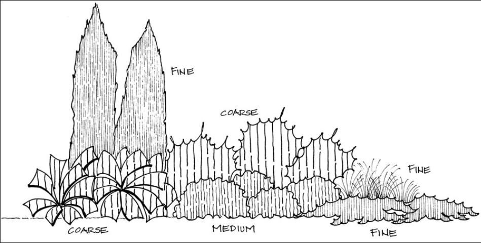
Texture affects the perception of distance and scale. To make a space feel larger, locate plants so that the fine textures are along the outer perimeter, the medium textures are in the middle, and the coarse textures are closest to the viewer. The small size of the fine texture recedes in the landscape and is perceived as being farther away. To make a space feel smaller, place the coarse textures along the outer perimeter and the fine textures closest to the viewer. The detail of the coarse texture makes the plants appear closer and makes the space feel smaller. The perceived texture of plants can also change with the distance from the plant. Plants that are coarse close-up can look fine textured from a distance. Bold colors increase the contrast and make the texture appear coarser, while muted colors can flatten texture. Hardscape with a coarse texture—such as very rough rocks and bold, large timbers—tends to make all plant material appear more medium textured. Designers often develop a texture study (Figure 8) on paper to help decide the arrangement of plant materials. The drawing mimics texture by using different line weights and spacing to represent fine, medium, and coarse textures.
Color
Color in plant material and hardscape adds interest and variety to the landscape. Color is the most conspicuous element in the landscape and is usually the focus of most homeowners; however, it is also the most temporary element, usually lasting only a few weeks a year for individual plants. The use of color is guided by color theory (use of the color wheel) to create color schemes. A simple description of the color wheel includes the three primary colors of red, blue, and yellow; the three secondary colors (a mix of two primaries) of green, orange, and violet; and six tertiary colors (a mix of one adjacent primary and secondary color), such as red-orange. Color theory explains the relationship of colors to each other and how they should be used in a composition. The basic color schemes are monochromatic, analogous, and complementary.
Monochromatic Scheme
A monochromatic color scheme uses only one color. In landscaping, this usually means one other color besides the green color in the foliage. A garden that is all green depends more on form and texture for contrast and interest. One color can have many light and dark variations, which can add interest. An example of a monochromatic scheme is a white garden with white flowers, white variegated foliage, and white garden ornaments.
Analogous Scheme
Analogous (sometimes called harmonious) color schemes are any three to five colors that are adjacent on the color wheel, such as red, red-orange, orange, yellow-orange, and yellow, or blue, blue-violet, and violet. The colors are related to each other because they typically include two primary colors mixed to form a secondary and two tertiary colors, which means they share common properties.
Complementary Scheme
Complementary colors are those that are opposite each other on the color wheel. They tend to have high contrast between them. The most common sets are violet and yellow, red and green, and blue and orange. Complementary colors are often found naturally in flowers; a common pair is yellow and violet.
Color in Plants and Hardscape
Color is found in the flowers, foliage, bark, and fruit of plants. Foliage typically provides the overall background color for flower colors. Green foliage in all its various shades is the dominant color by quantity, but other colors capture attention more readily because of their high contrast to the color green.
Color is also found in buildings, rocks, pavers, wood, and furniture. Most colors in natural materials, such as stone and wood, are typically muted and tend to be variations of brown, tan, and pale yellow. Bright colors in the hardscape are usually found in man-made materials, such as painted furniture, brightly colored ceramic containers or sculptures, and glass ornaments.
Properties of Color
Color is an important element for creating interest and variety in the landscape. Colors have properties that can affect emotions, spatial perception, light quality, balance, and emphasis. One property of color is described relative to temperature—colors appear to be cool or warm and can affect emotions or feelings. Cool colors tend to be calming and should be used in areas for relaxation and serenity. Warm colors tend to be more exciting and should be used in areas for entertaining and parties. The "temperature" of colors can also affect the perception of distance. Cool colors tend to recede and are perceived as being farther away, making a space feel larger. Warm colors tend to advance and are perceived as being closer, making a space feel smaller.
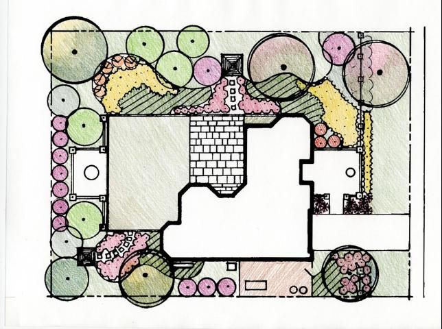
Color can also be used to capture attention and direct views. Focal points can be created with bright colors. For example, bright yellow, which has the highest intensity, also has a high contrast with all other colors (often described as a "pop" of color) and should be used sparingly. A small amount of intense color has as much visual weight as a large amount of a more subdued or weaker color. Color schemes in the garden can change with the seasons. Summer colors are usually more varied and bright with more flowers, while winter colors tend to be monochromatic and darker with more foliage. Color is also affected by light quality, which changes with the time of day and time of year. Brighter, more intense summer sun makes colors appear more saturated and intense, while the filtered light of winter makes colors appear more subdued. When choosing a color scheme, consideration should be given to the time of day the yard will be used. Because color is temporary, it should be used to highlight more enduring elements, such as texture and form. A color study (Figure 9) on a plan view is helpful for making color choices. Color schemes are drawn on the plan to show the amount and proposed location of various colors.
Visual Weight
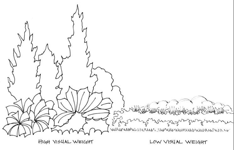
Visual weight is the concept that combinations of certain features have more importance in the composition based on mass and contrast. Some areas of a composition are more noticeable and memorable, while others fade into the background. This does not mean that the background features are unimportant—they create a cohesive look by linking together features of high visual weight, and they provide a resting place for the eye. A composition where all features have high visual weight often looks chaotic because the eye tends to bounce between the features. High visual weight usually comes from a group of plants with one or a few of the following characteristics: upright or unusual forms, large size, bright colors, bold texture, and diagonal lines. Low visual weight is found in low horizontal lines, prostrate or low forms, fine texture, and subdued or dull colors (Figure 10).
Principles of Design
Design principles guide designers in organizing elements for a visually pleasing landscape. A harmonious composition can be achieved through the principles of proportion, order, repetition, and unity. All of the principles are related, and applying one principle helps achieve the others. Physical and psychological comfort are two important concepts in design that are achieved through use of these principles. People feel more psychologically comfortable in a landscape that has order and repetition. Organized landscapes with predictable patterns (signs of human care) are easier to "read" and tend to make people feel at ease. Psychological comfort is also affected by the sense of pleasure that a viewer perceives from a unified or harmonious landscape. Users feel more physically comfortable, function better, and feel more secure in a landscape with proportions compatible to human scale.
Proportion
Relative proportion is the size of an object in relation to other objects. Absolute proportion is the scale or size of an object. An important absolute scale in design is the human scale (size of the human body) because the size of other objects is considered relative to humans. Plant material, garden structures, and ornaments should be considered relative to human scale. Other important relative proportions include the size of the house, yard, and the area to be planted.
Proportion in Plants
Proportion can be found in plant material relative to people (Figure 9), the surrounding plants, and the house. When all three are in proportion, the composition feels balanced and harmonious. A feeling of balance can also be achieved by having equal proportions of open space and planted space. Using markedly different plant sizes can help to achieve dominance (emphasis) through contrast with a large plant. Using plants that are similar in size can help to achieve rhythm through repetition of size.
Proportion in Hardscape
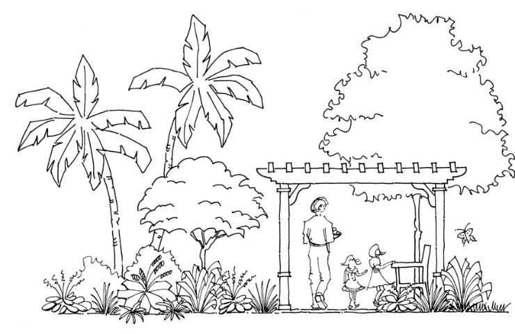
Features are most functional for people when they fit the human body. Benches, tables, pathways, arbors, and gazebos work best when people can use them easily and feel comfortable using them (Figure 11). The hardscape should also be proportional to the house—a deck or patio should be large enough for entertaining but not so large that it doesn't fit the scale of the house.
Proportions in Voids
Human scale is also important for psychological comfort in voids or open spaces. People feel more secure in smaller open areas, such as patios and terraces. An important concept of spatial comfort is enclosure. Most people feel at ease with some sort of overhead condition (Figure 11) that implies a ceiling. The enclosure does not have to be solid; in fact, an implied enclosure, such as tree branches, serves as a good psychological enclosure that still allows light and views of the sky.
Order
Order generally refers to the spatial layout or organization of the design and is most often achieved through balance. Balance is the concept of equal visual attraction and weight, usually around a real or imaginary central axis. Form, color, size, and texture all affect balance. Balance can be symmetrical, asymmetrical, or perspective. Order can also be achieved by massing features or elements into distinct groups and arranging them around a central point.
Symmetrical Balance
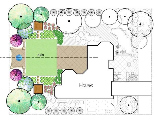
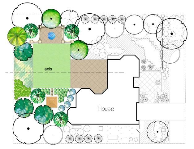
Symmetrical balance is achieved when the same objects (mirror images) are placed on either side of an axis. Figure 12 shows the same trees, plants, and structures on both sides of the axis. This type of balance is used in formal designs and is one of the oldest and most desired spatial organization concepts. This is because the mind naturally divides space by assuming a central axis and then seeks an even distribution of objects or mass (visual weight). Many historic gardens are organized using this concept.
Asymmetrical Balance
Asymmetrical balance is achieved by equal visual weight of nonequivalent forms, color, or texture on either side of an axis. This type of balance is informal and is usually achieved by masses of plants that appear to be the same in visual weight rather than total mass. Figure 13 shows groupings of trees and structures that are approximately equal in visual weight on either side of the axis. The mass can be achieved by combinations of plants, structures, and garden ornaments. To create balance, features with large sizes, dense forms, bright colors, and coarse textures appear heavier and should be used sparingly, while small sizes, sparse forms, gray or subdued colors, and fine texture appear lighter and should be used in greater amounts.
Perspective Balance
Perspective balance is concerned with the balance of the foreground, midground, and background. When looking at a composition, the objects in front usually have greater visual weight because they are closer to the viewer. This can be balanced, if desired, by using larger objects, brighter colors, or coarse texture in the background. In most cases, either the foreground or background should be dominant.
Mass Collection
Mass collection is the grouping of features based on similarities and then arranging the groups around a central space or feature. A good example is the organization of plant material in masses around an open circular lawn area or an open gravel seating area.
Repetition
Repetition is created by the repeated use of elements or features to create patterns or a sequence in the landscape. Repeating line, form, color, and texture creates rhythm in the landscape. Repetition must be used with care—too much repetition can create monotony, and too little can create confusion. Simple repetition is the use of the same object in a line or the grouping of a geometric form, such as a square, in an organized pattern.
Repetition can be made more interesting by using alternation, which is a minor change in the sequence on a regular basis—for example, using a square form in a line with a circular form inserted every fifth square. Inversion is another type of alternation where selected elements are changed so the characteristics are opposite the original elements. An example might be a row of vase-shaped plants and pyramidal plants in an ordered sequence.
Gradation, which is the gradual change in certain characteristics of a feature, is another way to make repetition more interesting. An example would be the use of a square form that gradually becomes smaller or larger.
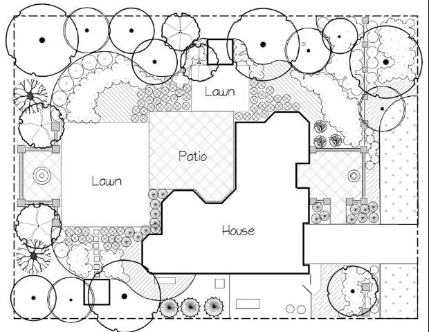
Repetition does not always create a pattern; sometimes it is simply the repeated use of the same color, texture, or form throughout the landscape. Figure 14 illustrates repetition of a square form in an entry courtyard, lawn panels, a patio, and a water feature.
Repetition in Plants and Hardscape
Using the same plant repeatedly in a landscape is simple repetition. A grass garden is a good example of subtle plant repetition. Gradation can be achieved with a gradual change in height or size (e.g., using small grasses in front, backed by medium grasses, and then large grasses). A more obvious gradation is plants that transition from fine to coarse texture, or from light green to dark green.
Material can be used repeatedly throughout the yard for unity, but interest can be created by slightly varying the size, texture, or color of hardscape material. Repetition and pattern can be made most obvious in the hardscape because duplication is easiest with built materials that are manufactured to exact dimensions.
Unity
Unity is achieved by linking elements and features to create a consistent character in the composition. Unity is sometimes referred to as harmony—the concept of everything fitting together. By comparison, scattered groupings of plants and unrelated garden ornaments are the opposite of unity. Unity is achieved by using dominance, interconnection, unity of three (described below), and simplicity to arrange colors, textures, and form. Although hardscapes and plants can be unified by the blending of similar characteristics, some variety is also important to create interest. The simplest way to create unity is through the use of a design theme or a design style. Design themes and styles have a well-defined set of features that have maintained their popularity over time because they are visually pleasing to many.
Unity by Dominance
Dominance or emphasis is the property of a plant or object that attracts and holds attention, making the object an important feature. The ability of an object to capture attention usually depends on contrast with adjacent objects. A typical example for a garden would be a very brightly colored ceramic pot among green foliage.
Dominant features that capture attention are called focal points. Focal points are used to draw attention to a particular location, move the eye around the space, or guide circulation. Emphasis is created through contrast in size, color, form, or texture.
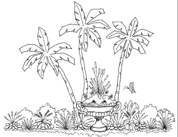
Plants that draw attention are often called specimen plants. These are plants with a unique form, size, or texture that stand out from the surrounding plants. Ordinary plants can also be used for emphasis by isolating the plant in a container (Figure 15) or an open space. Purposefully placing plants in this way draws attention to the plant. Specimen plants are usually used to draw attention to entrances, pathways, or statuary. Garden ornaments also work well to attract attention because they are often dramatically different from plant material. Form and color are usually the characteristics that contrast the most with plants. Sculptures, planters, and furniture have forms that are easily recognizable and distinguishable from plants.
Unity by Interconnection
Interconnection, the concept of physical linkage (touching) of various features, is present in all designs. Although all features are linked to other features, the key is to make the linkage seamless so that the features blend or fit together. Hardscape is important to interconnection because it typically serves to organize and link spaces in the garden. Continuation of a line, such as a path, the edge of a built object, or a defined edge of a plant bed, can create unity through interconnection.
Unity of Three
Features that are grouped in threes, or in other groups of odd numbers, such as in groups of five or seven, feel more balanced to the eye and give a stronger sense of unity. Odd numbers allow for staggered variations in height, such as small, medium, and large, that provide more interest. Odd numbers are often seen or perceived as a group and are not as easily split or visually divided as even numbers.
Unity by Simplicity
Simplicity is the concept of reducing or eliminating nonessentials to avoid a chaotic look. This brings clarity and purpose to the design. Many designers achieve simplicity by thoughtfully removing features from a design while still preserving its integrity.
Applying the Principles and Elements of Design
While it is useful to know the elements and principles of design, it is sometimes difficult to understand how to apply them to your ideas for your yard. Each site presents challenges and opportunities for individual design and expression and requires unique application of the elements and principles. Studying how the elements and principles have been applied in an existing design that appeals to you is a good place to start. The best way to create a good design is to borrow ideas from designs that you find attractive and adapt them to your particular site conditions.
Personal Style and Sense of Place
To discover and identify your personal style, think about other yards or landscapes you enjoy. Observe the landscapes in your neighborhood and other neighborhoods in your community. Study those that appeal to you and note the features and types of plant material. Also try to identify the elements of design, such as color, texture, and form, and determine how line is used in the landscape. Study the view and try to determine how balance and rhythm are created. Also, look for dominance and try to figure out how unity is produced. Studying landscapes in your neighborhood and community is important because most people feel more comfortable when they "fit in" with their neighbors. There is often a strong social desire to feel like part of the community and contribute to the neighborhood fabric. The concept of fitting in is referred to as "genus loci," or having a sense of place. Sense of place also refers to the regional context—the surrounding landscapes, both natural and planned, that have an influence on the design and plant materials to be used.
Other sources of inspiration include demonstration gardens or landscapes, local botanical gardens, and displays at local nurseries. Avoid the large national chain store nurseries, as their plants are not often grown locally, and their plant selection may not be as suitable to your area. They can be good, however, for buying temporary annuals for small areas. Visit demonstration gardens and botanical gardens to look for interesting and appealing plant groupings. Note the type of microclimate for each group to determine if it will work in your yard. Because these gardens are designed for your area, you can use the exact combination of plant material, as long as it fits the sun and shade requirements. Ask about growing and maintenance requirements to determine if the plants will fit your needs. At local nurseries, you can gather and arrange several potted plants to see how they look together. Although they are small, you can still get a good idea about texture and color composition.
Another way to identify your personal style is to look through magazines and books for ideas. Study the images and note the details. What do you like about the design? Will it work in your space? You will not be able to duplicate the exact design because your site will be different in location, size, and shape, but there are often many features you can adapt to your site. Appropriate hardscape materials and plants for your region can be substituted for those in the sample design by choosing materials and plants with the same characteristics. Try to picture how the features will look in your yard and where they might be placed. Several different ideas may be knitted together to create a final design. It is important to keep in mind that the gardens and yards you see in magazines and books are chosen because they are outstanding examples, and they are typically gardens that are cared for by people with extensive gardening knowledge. Keep in mind your (or your contractor's) maintenance abilities and knowledge and adjust the design appropriately.
Site Conditions
How do you know if a design you like will work in your yard? First, compare the architectural style of the houses and try to find similarities between your house and the sample house. Study the hardscape materials in the sample design. Do the same colors and materials work with your house? If necessary, what substitutions could you use and still retain the desired look? Imagine your house with the same or similar plant materials—remember that the plants can be arranged differently to fit the dimensions of your yard. For more information on plant selection, see Right Plant, Right Place: The Art and Science of Landscape Design – Plant Selection and Siting (https://edis.ifas.ufl.edu/EP416).
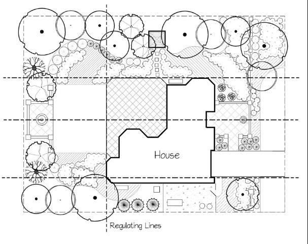
Second, look at the shape and size of the footprint (outline) of your house in relation to your lot size and shape. For this you will need an official boundary survey that shows the exact footprint, with dimensions, and it's location within the property boundaries. This will tell you if you have room for the features you desire and where those features can be located. Pay particular attention to the shape of the spaces or voids between your house and the property lines. These are the areas where your features will be located and will help determine the potential form or shape for those features. For example, a rectangular yard may look best with rectangular shapes in the hardscape. The shape of the house will also provide clues as to the type of shape you should use in the yard. If the house has diagonal walls or hexagon shapes, this could inspire a diagonal or hexagon shape in the landscape. Designers will often draw lines on the plan that extend from the house edges or corners to the property lines. Figure 16 illustrates lines used to delineate the shape of spaces and locate the patio and focal features. These are called regulating lines because they help regulate space and define forms that extend from the house or between the house and the property lines.
Third, thoroughly understand your site and how you want to use the space. Begin with a site inventory and analysis. Note all the conditions of the space and analyze how the conditions might affect your design. Each condition can be seen as an opportunity—a positive condition that will help achieve your design—or a constraint—a negative condition that might impact your design, but could possibly be turned into an opportunity. Examples of opportunities and/or constraints include land forms, such as slopes and flat areas, and natural features, such as trees and rocks, or built features, such as swimming pools and fences. Depending on the desired design, each could present an opportunity or a constraint.
Locating Features and Defining Outdoor Rooms
Once you have determined the architectural style, the shape of the yard spaces, and the opportunities of your site, you can begin to locate the features and give them form. Most features will have a logical location based on the use or type of feature and the site opportunities. The yard is typically considered an extension of the house, and it makes sense to locate the most heavily used features of the yard close to backdoor entrance. For example, the outdoor dining/seating area (patio or deck) is typically located adjacent to the house for convenience and physical comfort. Other features, such as dog runs and vegetable gardens, are often located on the side of the house to hide them from view, and play or recreation areas are often located in full view of the kitchen or family rooms so that parents can watch children at play.
Spatially dividing a yard into separate uses is often referred to as creating outdoor rooms (Figure 17) and is a fundamental concept of outdoor design. Logical arrangement of the "rooms" creates a functional and aesthetically pleasing landscape. Spaces can be delineated through the use of different materials, such as the edge of a stone patio against a lawn panel; through a change in elevation (steps); through the use of a form, such as a square lawn panel; through the use of a feature, such as a low garden wall or small trees; or through the use of plants to create implied walls and ceilings. The elements and principles of design are particularly useful when creating rooms because they help to define spaces, add interest, and create a unified, functional, and aesthetically pleasing landscape.
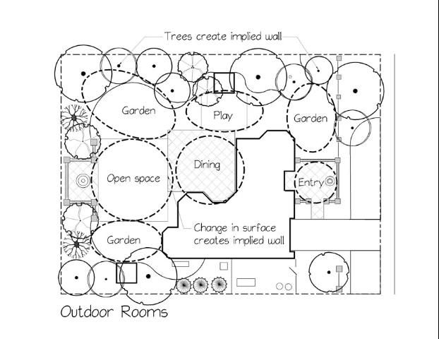
Color and texture can also be used to differentiate spaces by making each area visually unique or distinct. The hierarchy of spaces or rooms can also be delineated through the use of visual weight. Areas of high importance can include features and elements that give them high visual weight and attract attention. Scale and proportion are also useful principles for spatial organization and hierarchy. A space with a distinctly different size relative to the other spaces tends to assume more importance because of the contrast. Scale is also very important in determining the type of features that can be used in the landscape; different uses require different square footage to be functional. For example, features such as swimming pools, dog runs, and vegetable gardens have a minimum required size, and a patio has a minimum size depending on the number of people expected to use the patio at one time.
Spaces can be connected through the use of lines, such as pathways, or they can be visually connected through the use of emphasis (focal points) that captures attention and leads the eye, or through repetition of elements that connects spaces through similar objects. Another important concept of outdoor design is direction or physical movement within a space. Movement or circulation can be controlled through the use of different materials, spatial organization, focal points, and intentional marking of pathways. Using all of the elements and principles will tie the entire landscape together in a unified, functional manner.
Summary
The fundamental concept of landscape design is problem solving through the use of horticultural science, artful composition, and spatial organization to create attractive and functional outdoor "rooms" for different uses. The elements (visual qualities)—line, form, texture, color, and visual weight, and principles (guidelines) —proportion, order, repetition, and unity of design are used to create spaces, connect them, and make them visually pleasing to the eye.