Introduction
As Extension professionals, we work with complex issues, primarily translating research findings into practical recommendations. Fulfilling this vital role means understanding and meeting our audiences' communication needs. Our audiences are a variety of stakeholder groups with varying levels of formal academic/scientific expertise. Communication among Extension professionals and those groups has come a long way from the early days, when materials were shared without considering and accommodating each others' strengths and weaknesses. Using research-backed ideas about refining our words and explanations without compromising our scientific content, helps Americans continue to have high levels of trust in science (Khan et al., 2020). This document is intended to help Extension professionals and other science communication and engagement professionals create visualizations of spatially-based data that are meaningful to a variety of stakeholders.
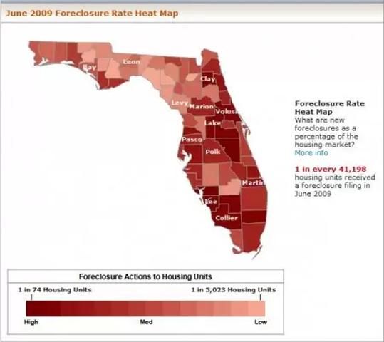
One of the other tools we use to communicate with our audiences is visual representation of data, which are also known as visualizations of data. These include graphs, charts, and data overlaid onto maps (Lagrosa & Demers, 2012). We all know we must thoughtfully prepare our text and words for broad understanding, but we often do not realize we should consider changing our images, including charts, graphs, and map-based visualizations from their forms used with highly knowledgeable audiences (Light & Bartlein, 2004). Research in science communication and education has offered ways, in a manner akin to adapting our writing style, for communicators to apply strategies to revising data visualizations for broad meaning-making (Harrower & Brewer, 2011; Moreland, 2009; Rowe, Stofer, Barthel, & Hunter, 2010; Stofer, 2013; Stofer, 2016).

Credit: http://lakelandfloridaliving.com/lakeland-real-estate-homes/lakeland-real-estate-update-florida-california-nevada-still-accounting-for-bulk-of-foreclosures/
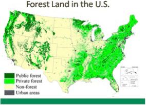
In Extension, we may want to share visualizations of data on maps for a wide variety of programs. For example, we might visualize household or business fertilizer, energy, or water use, production rates for particular crops or livestock, air and water temperatures, polluted waterways, or acreage of forests. This document offers practical strategies for producing or revising map-based visualizations of data to make it easier for audiences of varying academic and non-academic backgrounds to understand. Implementing these strategies will allow audiences to concentrate on the message to be conveyed.

Credit: Greenwood
Recommendations for Optimizing Visualizations to Convey Extension Messages
Budget for Development
This process can involve a significant amount of time and resources. Build time and money into your budget if you can. Reach out to experts in education research, communication, and graphic design who may already have the tools and expertise you might need. UF's mailing list for the GIS community to share knowledge is available at https://mail.geoplan.ufl.edu/mailman/listinfo/uf-gis.
There are some low-cost options for software if you want to create your own visualizations from data. Tableau Public is a free application with an option to purchase a license for unlimited data file sizes that is available at https://public.tableau.com/en-us/s/download. You will have to hunt around and customize the color scales a bit, but it is possible. UF also has a site license for ArcGIS, a design platform, for a yearly use fee of $100–$500, depending on how extensively you (and your team) use it. It is available through the UF GeoPlan Center at https://www.geoplan.ufl.edu/licensed_software.shtml. Your department may already have a copy.
Get Help
Besides simply consulting with experts, you may want to partner with someone if you need to do extensive design and do not have the software or software skills. Some counties may have personnel with graphic design or geographic information systems expertise. UF/IFAS Communications and the above-mentioned UF GIS community may also have contacts. If you are not the original data owner and visualization creator, you may also need permission from the data owner to make alterations, or you may be able to ask the creator to make the adjustments you need for your audiences.
Consider Your Audience
As always, start with a front-end assessment of your audience to determine what they need and want to know about your topic, as well as what they already know, as it may be more than or different from what you think. This could be part of any standard needs assessment. Sometimes this could be a summative evaluation from a previous project or program. This will allow you to build on the audience's natural interest and motivation for learning about the subject.
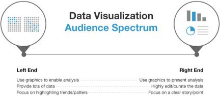
You may have to create a few different versions of the visualization to best serve different stakeholder groups. Blogger Ryan Morrill offers suggestions for different stakeholder considerations, which are shown in Figure 3.

Credit: Ryan Morrill, https://go.forrester.com/blogs/13-11-11-data_visualization_catering_to_your_audience/
Consider Your Goal
As in Figure 3, you will likely have different goals for different audiences, and those different goals will mean presenting different data in the visualization. First, think about what it is you are trying to convey with your visualization. Align this message with your audience's needs and interests and other priorities from funders or other stakeholders. Are you trying to show a particular pattern or an abnormality? Does the audience need to pick out many particular values or just a threshold? Make this message the primary focus of the end product. This means you will probably need to background other tasks. This means removing tasks that get in the way of your intended message, such as figuring out what area the map is showing.
Background Irrelevant Tasks
When we ask an audience to view an untranslated visualization, we ask them to do several things at once. Think of it as trying to find your way in a foreign country where you do not speak the language—when you look at a sign, first you have to translate the words on the sign, and then you have to understand where you want to go. As with any multitasking, this can lead to working memory overload, and, eventually, frustration when we cannot complete all the tasks and make sense of what we are seeing. At the very least, it takes a user more time than is necessary.
When working with visualizations that are not thoughtfully designed for a particular audience, users may try to figure out what the colors mean, what the symbols and abbreviations mean, and what area is shown, let alone what is shown, which is your ultimate message. While everyone ideally would have an in-depth understanding of every topic, including geography and scientific measurement, this is not the case. Remember your goal, and remove other information processing that distracts from your task.
- Use audience-appropriate measurement units instead of scientific units; if your audience deals mostly in inches and feet, make sure you do not use meters. If your audience is sophisticated, you might present both scientific and familiar units side-by-side to introduce the scientific convention—as long as it does not clutter your overall visual layout (Telg, 2013).
- Use familiar wording in titles and supporting captions. In the same way you translate documents, make sure you use audience-appropriate language levels based on your needs assessment. Avoid abbreviations and acronyms unless you define them in the caption.
- Use geographic labels. Labeling both large-scale and small-scale areas will orient your audience to the location you are presenting and keep them from trying to make sure they know the location shown. Country, state, or county lines can help, but use names for areas whenever it does not interfere with the visual design or the data presentation.
Consider Your Format
Print, web, and slide presentations via projector could appear quite different. You may design them all on the same computer, but the final display output may vary significantly. Understand and account for the differences in color, font size, and contrast and brightness.
Choose Colors Wisely
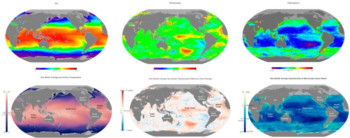
Colors, particularly hues1, are symbols. They carry many cultural meanings, and these may vary by audience and unconsciously support or interfere with communication. To scientists, the six-hued rainbow color scale (Figure 4) has been used frequently since graduate school (Light & Bartlein, 2004). However, our audiences come from different backgrounds and have different, non-academic expertise; they are often less experienced with the color scales scientists use on a professional basis. On top of this, human color vision processing can also unconsciously aid or detract from communication. The rainbow color scale represents red as highest values, but the human brain picks out yellow-greens most easily (think of yellow highlighters) (Faughn & Serway, 2003). Those yellow-greens depict middle, and therefore usually less important, values of continuous variables. Finally, the rainbow color scale usually uses different amounts of data for each hue. For example, red might appear to represent ten data values on the scale, while green represents only three—again giving more visual weight to the red values than the numerical data actually convey.

Credit: Rob Simmon, NASA
There are several specific tips regarding color choice (see Figures 5 and 6):
- Use only as many colors as you have dimensions of data. If you are only representing one variable, use a continuous scale, which is sometimes called a color ramp, of a single hue for interval or ordinal data and vary only the saturation, brightness, or both (see Figure 6). This has the added bonus of legibility to color-blind individuals, who will be able to detect the intensity differences. For an anomaly data set, use one color ramp for higher and one for lower, diverging from a neutral white, gray, or black for zero or average value. For qualitative, nominal, or categorical data, use distinct hues to represent equivalent but distinct groups.
- Choose culturally familiar color schemes. In the United States, for example, many people associate red with hot or warm temperature, and blue with cold temperature. However, many weather maps also use greens and purples, which do not have any cultural association with temperature.
- Choose the ends of your color ramp to maximize distinctiveness of the data you display. For example, participants in our studies had a difficult time judging colors at the very low and very high end of the brightness scales; start with a higher-than-zero level and end before you max out brightness.
- Consider whether using a segmented color ramp with fewer discrete steps could make your data more distinct than a continuous scale.
- Make sure the legend includes all your colors, including those representing data as well as those representing underlying geography. This is especially important to clarify instances where you have different reasons for areas of no data. For example, in remote-sensing visualizations of ocean data, one color may represent land where no data was collected intentionally, while another may represent ocean where no data was collected because of cloud cover or simply lack of instrument coverage.
- Use online tools, such as ColorBrewer (http://colorbrewer2.org), to help develop new scales as needed.

Credit: Katie Stofer, University of Florida, and Rob Simmon, NASA

Credit: Rob Simmon, NASA
Take Advantage of Visual Processing
Western readers read left-to-right, and they tend to look for background or given information on the left and new information on the right or bottom. Less-experienced audiences do not always naturally know to look for supporting elements of a visualization. Placing the title at the top and the legend to the left of your figure will take advantage of that, making it as easy as possible to notice these elements that could otherwise be overlooked.
Highlight What is Most Important
If there is a particular pattern in the data or a particular location that is illustrative of your message, then draw arrows to it, circle it, or use an inset to blow it up in detail. This will reinforce the message in your presentation or supporting text.
Provide Comparison Data
Your audience may not be as familiar with anomalous patterns of ocean temperature or even regular patterns of salinity. Find a visualization that they are familiar with (another objective of front-end evaluation of the audience), and use it to compare and contrast with the visualization that you want to discuss.
Prototype
Whenever possible, test your visualization with your audience before finalizing it, especially for print products. This will allow you to make sure colors do not carry unintended cultural meaning or are not hard to distinguish. Double-check your wording and determine whether your communication goal is met.
Solicit and Incorporate Feedback
Make your presentation interactive, asking the audience questions and ensuring that the space is safe to do so. Use evaluations at the end of your program to specifically ask about the visualizations, including a small copy of the visualization on the evaluation if possible to refresh participants' memories. Include their feedback in your next design.
Data Use, Reuse, and Crediting Sources
Many times, the data you want to visualize are produced by federal or state governments or are otherwise in the public domain. Thus, they are free for use. However, the visualizations themselves, which are distinct products, may or may not be free to use or alter without permission, at the very least. For educational purposes, many more rights may be granted, but double-check that you understand the rights granted to you and how the rights owner wants his or her product credited. Acknowledging the visualizer and data source also makes it easier for future users to track down more information.
Conclusion
While we are experts in our own particular disciplines, it can be hard to remember that our audiences have different kinds of expertise. By dealing with our data frequently, we have come to internalize certain understandings of color, geography, and terminology that we can take for granted. Taking a step back, putting yourself in your audience's shoes, and thoughtfully designing for lay audiences with different backgrounds will promote better communication.
Endnotes
1 Hue refers to the specific tone of a color. It is the color term probably closest to what the average person uses to refer to a color such as "red" or "blue," but color also has saturation, the amount of grey (also referred to as intensity), and brightness, the amount of black or white, that ultimately combine into a final shade (Boulton, 2010).
2 Note that this color scale starts too dark; novice research participants could not distinguish among shades at the bottom end of the scale in particular. For future use, I suggest starting with non-zero saturation and brightness levels.
3 While these color schemes for Sea Surface Temperature and Chlorophyll are improvements from the traditional rainbow scale, they are not necessarily ideal for a general audience. Our research participants did not find them immediately culturally meaningful. Always test your new schemes with your audiences.
Additional Resource
eXtension.org hosted a fellow, Laura Thompson, in data visualization in 2017. Her first blog post, https://archive.extension.org/2017/04/04/data-visualization-why-does-it-matter/, discusses data visualization broadly for Extension professionals.
References
Boulton, M. (2010). Hue, saturation and brightness. Designing for the Web. https://designingfortheweb.co.uk/part4/chapter17/
Faughn, J. S., & Serway, R. A. (2003). College Physics (6th ed.). Canada: Thomson, Brooks/Cole.
Harrower, M., & Brewer, C. A. (2011). ColorBrewer.org: An online tool for selecting colour schemes for maps. In The Map Reader (pp. 261–268). John Wiley & Sons, Ltd. http://dx.doi.org/10.1002/9780470979587.ch34
Khan, B., Robbins, C., & Okrent, A. (2020). 2020. Science and Engineering Indicators 2020: The State of U.S. Science and Engineering (NSB-2020-1). National Science Board, National Science Foundation. https://ncses.nsf.gov/pubs/nsb20201
Lagrosa, J., & Demers, C. (2012). Introduction to Geographic Information Systems. Gainesville: University of Florida Institute of Food and Agricultural Sciences. https://journals.flvc.org/edis/article/view/119691
Light, A., & Bartlein, P. J. (2004). The end of the rainbow? Color schemes for improved data graphics. EOS Transactions of the American Geophysical Union, 85(40): 385–391.
Moreland, K. (2009). Diverging color maps for scientific visualization. In G. Bebis, R. Boyle, B. Parvin, D. Koracin, Y. Kuno, J. Wang, D. Coming (Eds.), Advances in Visual Computing (Vol. 5876, pp. 92–103). Berlin, Heidelberg: Springer Berlin Heidelberg. http://www.springerlink.com/index/10.1007/978-3-642-10520-3_9
Rowe, S. M., Stofer, K., Barthel, C., & Hunter, N. (2010). Hatfield Marine Science Center Magic Planet Installation Evaluation Findings. Corvallis, OR: Oregon Sea Grant.
Stofer, K. A. (2013). Visualizers, Visualizations, and Visualizees: Differences in Meaning-Making by Scientific Experts and Novices from Global Visualizations of Ocean Data. Unpublished Doctoral Dissertation. Oregon State University, Corvallis, OR.
Stofer, K. A. (2016). When a Picture Isn't Worth 1000 Words: Learners Struggle to Find Meaning in Data Visualizations. Journal of Geoscience Education, 64(3), 231–241. https://doi.org/10.5408/14-053.1
Telg, R. (2013). Visual Communication. Gainesville: University of Florida Institute of Food and Agricultural Sciences. https://edis.ifas.ufl.edu/wc101