As part of the Savvy Survey Series, this publication provides Extension faculty with an overview of the process that uses email to invite participants to complete an online survey. Currently, the University of Florida has a license for Qualtrics survey software that allows each Extension faculty member to have an account for creating and conducting online surveys. Online surveys are an effective way to collect data for needs assessments in program planning (see, for example, Lamm, Israel, & Diehl, 2013) or for follow-up surveys evaluating outcomes or customer satisfaction with Extension programs (see, for example, Israel, 2013). Survey research shows that online surveys are sometimes able to obtain as high a response rate as that for mail surveys, but often they do not (Manfreda et al., 2008; Israel, 2013). There are times that an online survey is a practical, appropriate option. This fact sheet provides guidance for constructing an online questionnaire, addressing visual design and formatting considerations, and implementing an online survey. Extension faculty who incorporate best practices of questionnaire design and online survey procedures will be able to collect more useful data than those who do not use these best practices.
Considerations Specific to Constructing an Online Questionnaire
One of the major factors affecting the construction of an online questionnaire is the skill level and experience of the people to be surveyed, as well as the technology and/or software used by the survey designer. People who have limited access to computers, limited experience with computers, low literacy, or limited English skills are not well suited for completing online surveys. On the other hand, people who are well educated and regular users of email and the web would be a good population for an online survey.
The capabilities of survey software also influence the construction of online questionnaires. For example, Qualtrics software offers a suite of tools for developing a questionnaire, and the designer can include many types of questions and response formats (see The Savvy Survey Series #6: Writing Questions). A word of caution: using some of the fancier or more complex question formats may be burdensome for some Extension clients who are less sophisticated users of computers and the web. For general audiences, simple question formats should be used.
One of the great advantages of online questionnaires is the ability to automatically route respondents to the proper question through the use of "skip logic." Skip logic is a feature that helps to prevent the navigation errors that can occur with paper questionnaires because the survey software skips irrelevant questions and takes the respondent to the next pertinent question—a "respondent-friendly" feature. Because of the powerful navigation tools in online surveys, designers are often tempted to include more questions than would be possible in a paper questionnaire. As discussed in The Savvy Survey Series #5: The Process of Developing Survey Questions, a logic model can be used to help identify and select the best questions to include in the questionnaire.
Visual Design and Formatting
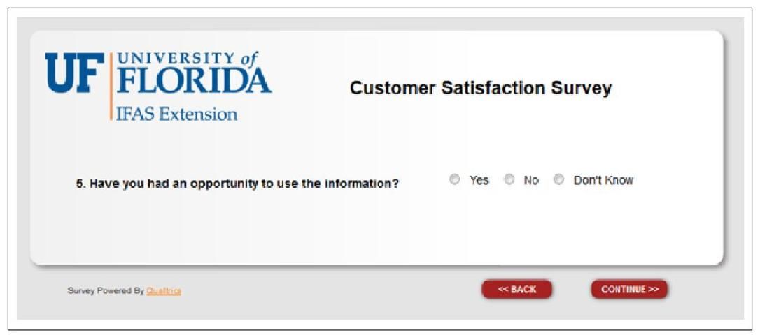
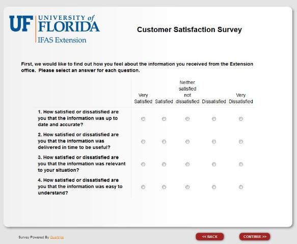
After choosing the best online format for the survey, next consider the visual design. One difference between online and paper surveys is that computer screens typically display a page in a landscape orientation while paper questionnaires display information in a portrait orientation. One important implication is that displaying multiple questions on a screen will often cause the respondent to have to scroll down the page in order to view all of the questions and response options. Scrolling can increase item nonresponse, so a best practice is to construct the online questionnaire using one question per screen (Figure 1) or a gridded set of items on a single screen (Figure 2). Given the increasing use of smartphones to answer surveys, grid questions can be difficult to see and answer on these devices. When many in a target audiences have a smartphone, a single question per screen is recommended.
The appearance of individual questions, as well as the entire questionnaire, can impact whether and how people answer the survey (Dillman, Smyth, & Christian, 2014). A good design provides cues to a respondent on how to navigate from one question to another and what kind of information the survey designer is looking for. For example, the size of the answer space for the question, "What could we do to improve our services to you and others in the county?" tells a respondent how much to write (a larger space encourages people to write more than a smaller space; see Israel, 2010).
Also, a "clean" design that clearly and consistently indicates where the question starts and where the associated answer choices are can help a respondent answer the questions accurately. Figures 1 and 2 show screens that are constructed with a consistent format, including a header at the top with the logo and survey title, and navigation buttons in the lower right area of the screen. There is little extra wording or graphics to distract the respondent.
For more detailed information about writing items or for formatting a questionnaire, see Writing Questions (#6) and Formatting Questionnaires (#7) in the Savvy Survey series. Finally, when constructing the online survey, it is a best practice to disable settings requiring a respondent to answer a question before moving to the next one. This is because requiring an answer to a question that does not apply to a particular respondent might cause him or her to quit the survey. In addition, participation in any survey approved by a university Institutional Review Board (IRB) is voluntary, so all questions must allow a respondent to skip to the next without answering.
Implementing an Online Survey
Preparation
Getting ready to conduct an online survey involves several steps. One is preparing the correspondence that will be used in the survey process. Because email messages are easily discarded and quickly buried in a person's inbox, an email pre-letter is not recommended. Note: pre-letters are often used for mail surveys to alert people to the upcoming survey. Instead, many surveys begin with an email message that includes the link to the website hosting the survey so that the person can respond immediately. In some situations, an email pre-letter might be appropriate when a sponsoring organization or leader is willing to send a message endorsing the survey and encouraging members to participate.
Each email message should be carefully worded using the principles of social exchange theory (Dillman et al., 2014) to encourage people to complete the survey. Briefly, social exchange theory asserts that people will be more likely to respond when the benefits (e.g., importance, salience, prestige, usefulness) outweigh the costs (e.g., time, effort, difficulty) and they trust those sending the survey to deliver the benefits. In practice, the email message should discuss how the respondent will benefit, why his or her response is important, and steps taken to reduce costs (e.g., limiting the time to complete the survey to a few minutes).
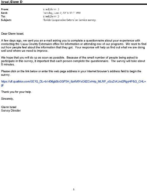
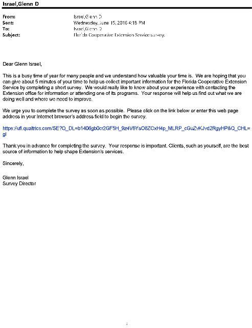
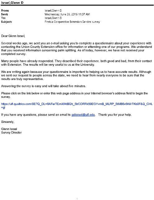
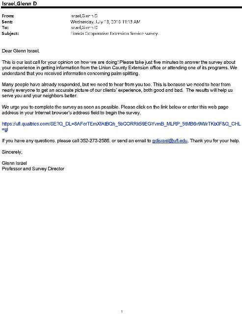
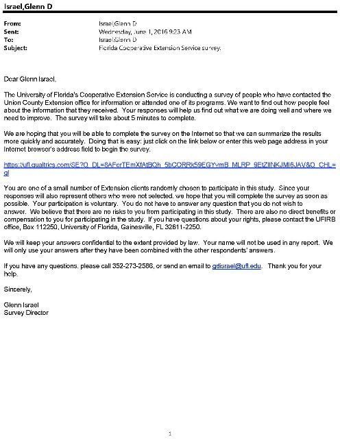
Appendix A provides a set of figures illustrating a series of messages, with each one tailored to play a specific role in the survey process. The initial invitation provides a complete explanation of the purpose of the survey, as well as the respondents' rights and how to respond. The second message starts by referring to the initial invitation and asking for a response now. The third takes a new approach with nonrespondents by acknowledging how busy people can be while the fourth contact uses a more assertive tone to "push" nonrespondents to complete the questionnaire. The final contact makes the "last call" plea to encourage procrastinators to respond before it is too late.
Note that each letter in the series includes a unique link for the person, which is used to manage access to the survey, as well as keeping records for sending follow-up messages to nonrespondents. Finally, the correspondence should provide all of the information needed for a person to make an informed decision to participate in the survey. (It is a best practice—and may be required—to have the questionnaire and letters reviewed and approved by the Institutional Review Board (IRB) to ensure compliance with regulations for conducting research on human subjects. See The Savvy Survey Series #9: The IRB Process for more information on this topic.)
When preparing the correspondence, consider how to personalize it. Research shows that personalization has a small but significant effect on increasing response rates (Dillman et al., 2014). Personalization helps to connect the respondent to the survey. This can be done by using individual names of clients in contact messages (e.g., Dear Joe Client) or by a group name with which clients identify (e.g., Dear Jackson County Cattlemen). Although including logos or images might help to personalize emails to a group, some people continue to use email applications without html formatting (which is required to display the graphics). Consequently, email messages should limit the use of logos and images.
A second step is preparing an email list with names, email addresses, and other relevant information. Spreadsheet programs, such as Microsoft Excel, are useful for organizing the information and keeping track of which people respond and which do not. Table 1 illustrates a spreadsheet list, which includes a column listing the response status and one recording the date on which a completed questionnaire is received. In addition, data in a spreadsheet can be used in a mail merge to personalize email messages by inserting names and other information.
Sending Survey Invitations
The survey invitation procedures should be tailored to the situation, as recommended by Dillman et al.'s Tailored Design Survey Method (2014). Table 2 shows the contact procedures for two online surveys. The FCES Customer Satisfaction Survey used up to five contacts with clients, while the Extension Evaluation Behaviors survey of Exten- sion faculty in eight states used a series of six contacts. A best practice is to use multiple contacts to obtain a high response rate and minimize the risk of nonresponse bias.
Although the sequence of contacts listed for the two examples in Table 2 may appear repetitive, each email mes- sage is somewhat different from the others. This difference is because each message (as illustrated by the messages in Appendix A) is designed to make a unique appeal in order to motivate people to respond. Note that both examples in Table 2 use multiple reminders in order to maximize the number of completed surveys. Research shows that the number of people who will respond after the 5th or 6th message is rather small, so additional invitations beyond the 4th or 5th might not yield much additional data and they can irritate people who do not want to complete the questionnaire.
With email invitations, the timing of follow-up reminders can be more closely spaced than with mail surveys. When the daily number of responses drops to zero for a given email message, then it is appropriate to send out the next email invitation to those who have not yet responded.
Qualtrics software provides several options for sending email invitations and accessing the online questionnaire. The options are outlined in Table 3. (There are a number of other software applications for conducting online surveys, and these include many of the same options. It is important to become familiar with the features of the chosen software, especially default settings, in order to avoid unintended problems that adversely affect the usefulness and credibility of the data.)
These options vary in complexity and the amount of faculty control, with the first having the least and the last having the most complexity and control. When using the second option, Qualtrics' internal mailing tool, the current version of the software reports the number of email invitations sent, as well as the number of emails that "bounce" or fail to be delivered. One advantage of the third option, using your own email software, is that bounced and delayed email messages can be identified, and obvious error in the email address can be more easily corrected.
In Summary
This publication in the Savvy Survey Series has focused on procedures for constructing an online questionnaire and implementing the survey. It noted that a population's access and experience, as well as software capabilities, are important considerations in the construction of the questionnaire. In addition, attending to the visual design and formatting of the questionnaire was emphasized as a critical step in making a respondent-friendly questionnaire. Finally, steps for getting prepared and for sending email invitations to complete the survey were reviewed. Using multiple contacts also was emphasized as a best practice for online surveys.
References
Dillman, D. A., J. D. Smyth, & L. M. Christian. (2014). Internet, phone, mail, and mixed-mode surveys: The tailored design method. (4th ed.) Hoboken, NJ: John Wiley and Sons.
Israel, G. D. (2010). Effects of answer space size on responses to open-ended questions in mail surveys. Journal of Official Statistics, 26(2), 271–285.
Israel, G. D. (2013). Combining mail and e-mail contacts to facilitate participation in mixed-mode surveys. Social Science Computer Review, 31, 3, 346–358. doi:10.1177/0894439312464942. Available at: https://journals.sagepub.com/doi/abs/10.1177/0894439312464942
Lamm, A. J., G. D. Israel, & D. Diehl. (2013). A national perspective on the current evaluation activities in Extension. Journal of Extension, 51(1), article 1FEA1. Available at: https://archives.joe.org/joe/2013february/a1.php
Manfreda, K. L., M. Bosnjak, J. Berelak, I. Haas, & V. Vehovar. (2008). Web surveys versus other survey modes: A meta-analysis comparing response rates. International Journal of Market Research, 50(1), 79–104. Available at: https://doi.org/10.1177/147078530805000107
Appendix A
