Importance-performance analysis can reveal whether Extension clients are satisfied with the elements of programs they consider most important. This document was developed for Extension professionals and it may also be useful to a broad range of practitioners who plan and evaluate programs. This is the second EDIS document in a series of three on using importance-performance analysis to prioritize Extension resources, and it covers how to collect data and use them to generate visual plots. The use of visual plots is one of two ways to analyze IPA data. The other articles in this series can be found at https://edis.ifas.ufl.edu/entity/topic/series_importance-performance_analysis.
Overview
Importance-performance analysis, or IPA, is used to gauge how satisfied people are with the quality of service they have received and the relative importance of certain characteristics of a place, issue, or program (Martilla & James, 1977; Sinischalchi et al., 2008). Extension professionals can use IPA to make decisions and prioritize resources by identifying the level of importance and satisfaction that clients associate with specific attributes of Extension programs.
As described in the first publication in this series (https://edis.ifas.ufl.edu/publication/wc250), importance is defined as the perceived value or significance felt by a clientele for an attribute of interest (Sinischalchi et al., 2008). Performance is defined as the judgement made by a clientele about the extent to which that attribute of interest is successful (Levenburg & Magal, 2005). Operationally, satisfaction with an attribute of interest is used to define performance.
Collecting IPA Data
IPA data may be collected in numerous ways. The goal is to obtain a numerical measure of both satisfaction (i.e., performance) and importance for each attribute of interest.
- First, it is necessary to identify the attributes being measured. Attributes may be related to programmatic goals, site characteristics, or management features.
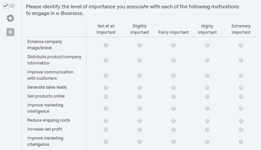
- Next, develop a questionnaire, with Likert or Likert-type scales corresponding to importance of and satisfaction with each attribute (see Figure 1). Likert scales are ordered, five-to-nine-point response scales commonly used to obtain respondents' preferences or agreement/disagreement with a particular statement or a group of statements (Bertram, 2006).

Credit: Adapted from "Applying importance-performance analysis to evaluate e-business strategies among small firms" by N. M. Levenburg and S. R. Magal. 2005. Journal of Marketing, 47(10), p. 38.
Often, single items are used for attributes. However, data may be more accurate when you create an index consisting of several items. The following is an example of different indexes and the individual items forming those indexes (see Table 1).
3. During questionnaire development, test the questionnaire for its validity and reliability. For further details about establishing the validity and reliability of questionnaires, please read The Savvy Survey #8: Pilot Testing and Pretesting Questionnaires https://edis.ifas.ufl.edu/publication/pd072 and The Savvy Survey #6d: Constructing Indices for a Questionnaire https://edis.ifas.ufl.edu/publication/pd069.
4. During pilot testing, you may find that changes need to be made to the questionnaire to establish validity and reliability. After all changes are made, the instrument will be ready for data collection.
5. To collect data, distribute the questionnaire to target audience members along with clear instructions for each respondent to assign an importance and satisfaction score to each identified attribute in the questionnaire (see Figure 1).
Constructing IPA Data Plots
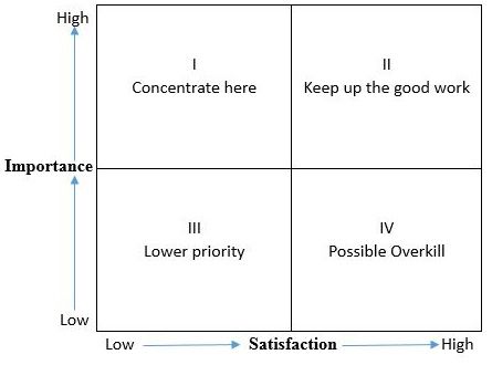
To construct IPA data plots, mean importance and satisfaction scores for identified individual attributes or an index of multiple attributes are both plotted on a two-dimensional scale grid (see Figure 2), which form a four-quadrant matrix (Levenburg & Magal, 2005). This matrix can be used to make decisions about different attributes. Overall, we should focus on increasing the satisfaction of characteristics that have a high importance score and a low satisfaction score (items that fall into the Concentrate here quadrant) and maintaining the satisfaction of items with both a high importance score and a high satisfaction score (items that fall under the Keep up the good work quadrant).

Credit: Adapted from "Importance-Performance Analysis" by J. A. Martilla and J. C. James, 1977, Journal of Marketing, 10(1), p. 78. Copyright 1977 by the American Marketing Association.
To create these IPA data plots, first calculate the mean importance and satisfaction scores for each individual attribute or index of attributes. Often the data are arranged in a table before plotting them in a graph (see Table 2). Then, to distribute these means into the four quadrants, we can compare the individual attribute's mean importance and mean satisfaction scores with the overall grand mean of importance and satisfaction scores to determine if each attribute's mean is high or low. The four quadrants based on this comparison would be high importance and high satisfaction; high importance and low satisfaction; low importance and high satisfaction; and low importance and low satisfaction (see Table 2).
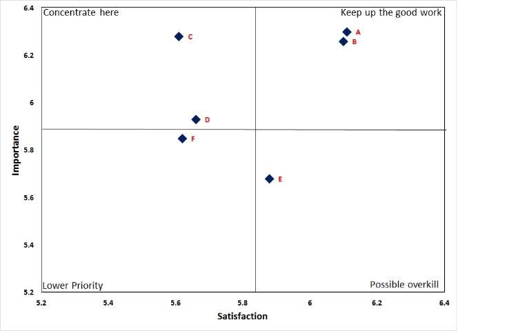
Next, plot these scores as a scatter plot in a data visualization software program like Microsoft Excel. The mean importance scores are typically plotted on the y-axis, and the mean satisfaction scores are plotted on the x-axis. To divide the scatter plot into four quadrants, calculate the importance grand mean and satisfaction grand mean of all attributes and place the two lines so that the satisfaction mean runs vertically to divide the x-axis and the importance mean runs horizontally to divide the y-axis. The two lines intersect at the grand mean for satisfaction and importance scores (see Figure 3). It is recommended that the importance and satisfaction scales should run from 0 to the highest data point. In the example below (see Figure 3) the scale should run from 0–7; however, we used a different scale for improved visualization.

Credit: Adapted from "Understanding the role of culture and heritage in community festivals: An importance-performance analysis" by N. C. Hugo and R. G. Lacher. 2014. Journal of Extension, 52(5), Article 28.
Interpreting IPA Data Plots
IPA data plots consist of four quadrants (Figure 2):
- Quadrant I contains those items with high importance scores and low satisfaction scores for attributes. It is labeled Concentrate here because the attributes that fall into this quadrant should receive the highest priority. Immediate action should be taken to address the challenges raised by these attributes, because the respondents are not satisfied with them, yet perceive them as highly important (Levenburg & Magal, 2005; Martilla & James, 1977).
- Quadrant II corresponds to high importance scores and high satisfaction scores for attributes. It is labeled Keep up the good work because the attributes in this quadrant are well served by the organization, and practitioners are encouraged to maintain current strategies for these attributes (Levenburg & Magal, 2005; Martilla & James, 1977).
- Quadrant III corresponds to low importance scores and low satisfaction scores for attributes. It is labeled Lower priority because the attributes in this quadrant are not crucial to the organization and can be discontinued or de-emphasized from an organization's agenda without detriment (Levenburg & Magal, 2005; Martilla & James, 1977).
- Quadrant IV contains items with low importance scores and high satisfaction scores. It is labeled Possible overkill because this quadrant represents the attributes from which time and resources can be diverted because they represent an unnecessary use of organizational resources. Respondents are satisfied with these items but they are not important (Levenburg & Magal, 2005; Martilla & James, 1977).
Conclusion
IPA data plots are attractive and easy-to-understand visual maps that display importance and satisfaction scores for certain attributes. By segregating attributes or issues into four quadrants, Extension educators can prioritize which attributes or issues need to be allocated the most resources and time. Specifically, for Extension programming and message communication decisions, Extension educators can concentrate on attributes that fall in quadrant I, Concentrate here, because these attributes or issues are most important to target audiences, but audiences are less satisfied with services. IPA data plots can be used for any issue or attributes that Extension educators are interested in, such as whether to prioritize programming about invasive weeds management; which topics need to be covered in a water conservation workshop; or which energy conservation messages resonate most with target audiences. IPA data plots are a tool that Extension educators can use regularly as part of their traditional needs assessment methods and evaluation toolbox.
Acknowledgements
The authors thank Randy Cantrell, Katie Stofer, and Yilin Zhuang for their helpful input on an earlier draft of this document.
References
Bertram, D. (2006.) Likert scales. http://poincare.matf.bg.ac.rs/~kristina/topic-dane-likert.pdf
Hugo, N. C., & Lacher, R. G. (2014.) Understanding the role of culture and heritage in community festivals: An importance-performance analysis. Journal of Extension 52(5), Article 28. https://tigerprints.clemson.edu/joe/vol52/iss5/28
Levenburg, N. M., & Magal, S. R. (2005.) Applying importance-performance analysis to evaluate e-business strategies among small firms. e-Service Journal, 3(3), 29–48. https://doi.org/10.2979/esj.2004.3.3.29
Martilla, J. A., & James, J. C. (1977.) Importance-performance analysis. Journal of Marketing, 10(1), 13–22. https://doi.org/10.2307/1250495
Siniscalchi, J. M., Beale, E. K., & Fortuna, A. (2008.) Using importance-performance analysis to evaluate training. Performance Improvement, 47(10), 30–35. https://doi.org/10.1002/pfi.20037