Introduction
Continuing the Savvy Survey Series, this fact sheet is one of three focused on working with survey data. In its most raw form, the data collected from surveys do not tell much of a story except who completed the survey, partially completed it, or did not respond at all. To truly interpret the data, it must be analyzed. Where does one begin the data analysis process? What computer program(s) can be used to analyze data? How should the data be analyzed? This publication serves to answer these questions.
Extension faculty members often use surveys to explore relevant situations when conducting needs and asset assessments, when planning for programs, or when assessing customer satisfaction. For detailed information concerning each of these survey uses, see Savvy Survey #2: Using Surveys in Everyday Extension Programming. Using the data received from any of these survey types, one may explore the amount of variation in the survey sample. An Extension professional may suspect that a subgroup within a survey sample is different from others represented, possibly demonstrating a greater need or level of satisfaction than other subgroups captured by the survey. Exploring whether this variation between groups exists can be easily performed through descriptive analyses (see measures of central tendency below for an example).
In order to evaluate the effectiveness of a program, an agent or specialist may opt to survey the knowledge or attitudes of the clients attending the program. To capture what participants know or feel at the end of a program, he or she could implement a posttest questionnaire. However, if one is curious about how much information their clients learned or how their attitudes changed after participation in a program, then either a pretest/posttest questionnaire or a pretest/follow-up questionnaire would need to be implemented. It is important to consider realistic expectations when evaluating a program. Participants should not be expected to make a drastic change in behavior within the duration of a program. Therefore, an agent should consider implementing a posttest/follow-up questionnaire in several waves in a specific timeframe after the program (e.g., six months, a year, and/or two years after completion of a program).
Unfortunately, it is not always possible to capture pretest and posttest information separately. There are some occasions where an agent or specialist may assess a program by asking participants to recall their knowledge or behaviors prior to participation in the program while also judging where they are in comparison to that prior state. This type of scenario requires the use of the retrospective pretest questionnaire. For further information about posttest questionnaires, pretest/posttest questionnaires, pretest/ follow-up questionnaires, and retrospective pretest questionnaires, see the EDIS publication WC135 Comparing Pretest-Posttest and Retrospective Evaluation Methods (https://edis.ifas.ufl.edu/publication/wc135).
Once the data has been collected, entered, and cleaned, the next step is to analyze the data. An Extension professional may ask whether some clients changed more than others. In relation to the retrospective pretest questionnaires, he or she may ask about the amount of change seen in each client between the beginning of the program and the end. Likewise, for some events, one may want to compare several factors between clients. For more information on comparing change between clients, comparing change within clients, and comparing several factors of change between clients, see the "Inferential Analyses" section of this publication.
Even if the purpose is to obtain simple summary numbers from the survey, it is important to understand that each analysis decision has the ability to impact the overall interpretation of the data set (Salant & Dillman, 1994). The scope of this fact sheet is to introduce the process of data analysis so the results can be used to make sound interpretations and conclusions, which then can be presented to stakeholders in an appropriate format (e.g., a report). This publication covers three aspects of data analysis:
- Programs for Analysis
- Descriptive Analyses
- Inferential Analyses
Each section is explained in further detail below.
Programs for Analysis
During the process of data entry (see Savvy Survey Series #15), the data is typically entered and stored using a computer program or database. Most computer programs used for data analysis can store survey results from many respondents. Thus, it has become commonplace for survey results to be entered into this type of program, either directly by the survey taker or manually by the surveyor.
One program that can be used for storing survey data is Microsoft Excel. This program comes as a part of the Microsoft Office Package that is installed on most Windows-based computers. Excel is also available for Apple computers as part of the Microsoft Office Package for Apple. Microsoft Excel is user-friendly and does not require a great deal of prior experience to work effectively. This program provides a user with a spreadsheet to fill out with information. Survey results can be placed into rows and columns. Each row (the horizontal cells) represents the data from one respondent (e.g., all of the data for every question for Respondent #1). Meanwhile, each column (the vertical cells) represents all of the respondent data for a survey question (i.e., all of the data for the question, for example, "Year of Birth," for the entire sample surveyed). Microsoft Excel can do several basic analytical tasks that will be discussed in later sections. Excel is not generally used for rigorous statistical testing, but Excel files are usually compatible with other statistical software, making transferring the data easy.
In addition to the basic Microsoft Excel package, there is an add-on tool for Microsoft Excel called EZAnalyze that can be used for data analysis. It is a free Excel plugin for calculating statistics and making simple graphs. It is available to download at www.ezanalyze.com. Disclaimer: this publication is only providing EZAnalyze as another option for data analysis. It does not in any way endorse the usage of this software plugin over others.
For conducting richer statistical analyses of survey data, one commonly used computer program is the Statistical Package for Social Sciences or SPSS. This program is available via UFApps (https://info.apps.ufl.edu/), which runs the software remotely.
SPSS is often perceived as user friendly because all of the commands for data analysis are provided in drop-down menus for users. However, the software also allows users to write in code in syntax mode to perform more specialized tasks. SPSS also uses a format similar to Microsoft Excel's spreadsheet form for displaying the data (Figure 1). Although other statistical programs have similar user interfaces, experienced users often prefer to type the commands (in syntax mode) for conducting the analysis because it can be faster than clicking through menus. Of course, writing computer commands to instruct the program to perform specific tasks and analyses requires additional study and practice. With SPSS, a user has to learn how to navigate the drop-down menus. This requires some time and effort; however, there are tutorials in the program and on the Internet to help users learn how to properly utilize SPSS. Once equipped with SPSS navigation skills, an Extension agent or specialist can begin the process of analyzing their survey data.

SPSS comes with two ways to view the data: variable view and data view. Variable view allows users to manipulate each column (rename the variable, change the type of data within them, store coding information, etc.), while data view displays the spreadsheet of the actual responses. The program also opens up a separate computer window to display the results from any data analysis (graphs, charts, tables, histograms, scatter plots, etc.). The results also show the computer code for the commands given to SPSS. These results can be copied and pasted into other computer programs, such as Microsoft Word or PowerPoint, when needed.
Other statistical software applications used in analyzing survey data are R and SAS. These programs are also available to all University of Florida students, faculty, and staff to use through UFApps (https://info.apps.ufl.edu/). Although SAS has a menu system called SAS ASSIST that works like SPSS, most SAS users prefer to type in commands to instruct the program to perform specific tasks. This process may take some time to learn, especially when exploring which codes to write for each analysis. SAS ASSIST is beneficial for users, including beginners, for it provides a common interface for completing tasks. It uses a menu approach that saves the computer code of the task completed to allow users to study and learn the codes for future use.
What SAS lacks in user-friendliness, it gains in statistical power. SAS can run more statistical analyses and does not have the data limit that other software packages have. This feature becomes very beneficial when working with a large amount of data from a large sample size (e.g., thousands of respondents). Similarly, R uses syntax for running data analysis.
Descriptive Analyses
With the survey data entered into a statistical program, it can now be analyzed. First the data are examined to create a description of the demographics of the sample. The data for all of the other questions are also summarized into descriptive statistics to provide users with frequencies of each variable in the data set.
- Frequency distribution: the number of respondents or objects which are similar in the sense that they ended up in the same category or had the same score (Huck, 2004).
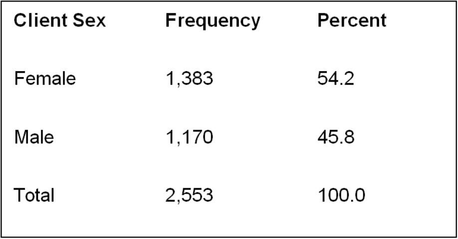
For example, frequency distributions can display the number of males and females in the survey sample (Figure 2), the range of ages, the specific number of respondents that belong to each age grouping, or even the number of specific responses to each survey question. The results for the demographic questions are often explained first in publications and reports to provide readers with a general understanding of the survey sample. This will also allow an Extension professional to determine if the sample accurately represents a larger population. Furthermore, frequency reports can be used to summarize demographic information of participating audiences for stakeholders, advisory committees, and funding agencies.
Results can also be viewed as graphs and charts. When choosing a graphic, it is important to consider the type of data you have (for more information on data types, see Savvy Survey #6e). Three common graphics include:
- Histogram: a graph representing continuous data (e.g., client age)
- Bar graph: a graph representing categorical data (e.g., the number of residents in each county or the number of clients enrolled in each extension program)
- Pie chart: an easy-to-understand picture showing how a full group is made up of subgroups and the relative size of the subgroups (Huck, 2004; Agresti & Finlay, 2009).
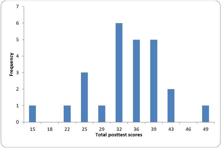
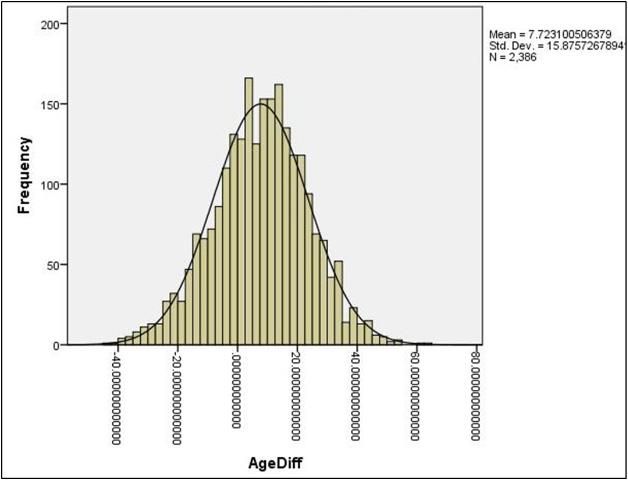
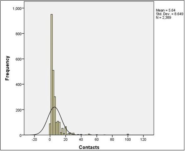
Figures such as histograms (Figure 3) can display the distributional shape of the data. If the scores in a data set form the shape of a normal distribution (Figure 4), most of the scores will be clustered near the middle of the distribution, and there will be gradual and symmetrical decrease in frequency in both directions away from the middle area of scores (this resembles a bell-shaped curve). On the other hand, in a skewed distribution (Figures 5 and 6), most of the scores are high or low with a small number of scores spread out in one direction away from the majority, creating an asymmetrical graph (Huck, 2004). The data should also be examined using normality tests to assess for homogeneity of variance to ensure critical assumptions are met before conducting inferential analyses as described later in this publication.
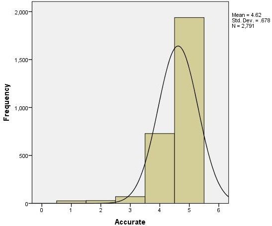
- Normality test: a method used to determine if the data is normally distributed and shows, more or less, a bell shaped curve.
- Homogeneity of variance: variance (a measure of how spread out a distribution is of a sample) in each of the samples is equal when comparing groups.
To further help readers get a feel for the collected data, results are commonly summarized into measures of central tendency. These measures provide a numerical index of the average score in the distribution (Salant & Dillman, 1994; Tuckman, 1999; Huck, 2004). Several types of central tendency measures include:
- Mode: the most frequently occurring number in a list.
- Example: given the twenty-five scores from Figure 3, the mode is equal to 32 (it appears 6 times).
- Median: the number that lies at the middle of a list of numbers ordered from low to high.
- Example: given the twenty-five scores from Figure 3, the median is equal to 36 (twelve of the 25 scores are smaller than 36; twelve are larger).
- Mean: the "average"; found by dividing the sum of the scores by the number of scores in the data.
- Example: given the twenty-five scores from Figure 3, the mean is equal to 33.72.
In addition to these measures, it is also useful to consider the dispersion or "scattering" of the data. It can be useful to know how uniformly (or how differently) respondents have answered a particular question (Salant & Dillman, 1994). This measures variability or the amount of change in the data. A simple way to measure variability is to calculate the range. Meanwhile, a more useful measure of dispersion is the standard deviation because it measures whether scores cluster together or are widely apart (Huck, 2004; Salant & Dillman, 1994).
-
Range: the difference between the lowest and highest scores.
-
Example: given the twenty-five scores from Figure 3, the range is equal to 49 minus 15, or 34.
-
Standard deviation: the measure of how values spread around a mean.
-
Example: given the twenty-five scores from Figure 3 with a mean of 33.72, the standard deviation is 7.44 (Agresti & Finlay, 2009; Huck, 2004; Salant & Dillman, 1994; Tuckman, 1999).
Descriptive statistics are also useful when presenting the results of any type of statistical analysis for a broader audience to view. For instance, if the results are being presented to county commissioners, then the advanced statistics discussed in the Inferential Analyses section may be too complicated to be easily understood by some individuals. However, with the use of descriptive analyses, the results of the advanced inferential analyses can be communicated more clearly. Rather than discuss the advanced analyses, the practical conclusions and their significance can be explained. It is up to the Extension professional to consider his/her audience when communicating the results of an analysis, while also ensuring that the analysis was conducted thoroughly so that the interpretations are accurate. For detailed information concerning the presentation of survey results, see Savvy Survey #17: Reporting Your Findings.
Inferential Analyses
In many instances, the primary objective of collecting survey data is to make conclusions that extend beyond the specific data sample using statistical inferences. Inferential analyses use appropriate principles and statistics that allow for generalizing survey results beyond the actual data set obtained (Huck, 2004). Inferential analyses help to ensure that the correct interpretation of the data is made. This is because descriptive statistics represent the tip of the iceberg; the real story is often found by looking deeper into the relationships in the data.
One type of analysis that can be performed is a t-test.
- T-test: a statistical test that compares the mean scores of two groups (Agresti & Finlay, 2009; Tuckman, 1999).
This analysis is especially useful when testing hypotheses (e.g., a null hypothesis is that the mean score of males equals the mean score of females, versus the alternate hypothesis that the mean score of males does not equal the mean score of females). Most situations call for a specific type of t-test, called the independent-samples t-test:
- Independent-samples t-test: a t-test using two samples where the selection of a unit from one group has no effect on the selection or non-selection of another unit from the second group (Agresti & Finlay, 2009).
- Example: a comparison of the mean score in financial literacy between men and women (the two sampled groups) on a recent evaluation provided after a recent Extension workshop.
However, in some situations, a paired-samples t-test is used to compare means between two samples. A common example of this in Extension programming is the pretest/ posttest, where there are repeated measurements for program participants. Both the pretest and the posttest must be linked to a specific person using an ID number. Such samples are said to be dependent. For pretest/posttest comparisons, a paired-sample t-test should be used.
Figure 7 shows the results for the paired-samples t-test from a retrospective pretest questionnaire for a Qualtrics survey software training session for extension agents. The questionnaire assessed the skill proficiency of agents using Qualtrics after the program and the skill proficiency of the same agents using Qualtrics before the training program. The results displayed include the mean score for before the program (T1), mean score after the program (T2), their respective standard deviations, the t-Score for the statistical analysis, and the significance level of the t-Score (t). By comparing the two means (1.720 and 3.192), it is apparent that the change between the pretest and the posttest is statistically significant (p = .000). Based on this analysis, the Extension professional can report that the training was successful, in that posttest skill proficiencies were significantly higher than pretest proficiencies.

- p-value or "p": a probability value also referred to as a "level of significance" or "alpha." It is the probability of attaining a test statistic at least as large as the one that was actually detected (under the assumption that the null hypothesis is true). Another way of interpreting "p-value" is the chance that the conclusion from the sample is wrong.
-
Example: The level of significance for the example below is "p = 0.05." In other words, the researcher(s) is/are willing to accept the risk of being wrong 5% of the time. The results of the paired-samples t-test showed a t-Score of 9.197 and a p-value of 0.000 (i.e., the chance of getting a t-score that large is less than 1 in 1000). This means that the change from pretest to posttest score is statistically significant. If the p-value was larger than 0.05 (e.g., p = 0.123), then the chance the conclusion from the sample is wrong is higher than the set level and the t-Score would not be statistically significant.
There are also some instances where more than two groups are available for analysis. A t-test cannot be used to analyze the data because of the increased chance of error in the testing (Agresti & Finlay, 2009). Instead, the analysis of variance or ANOVA test is used.
-
Analysis of variance (ANOVA) test: a statistical test used to compare the means from three or more groups.
-
Example: a comparison of the mean score in Body Mass Index (BMI) between sampled groups (whites, blacks, and Hispanics) on a recent evaluation collected prior to a recent Extension nutrition program.
Analysis of variance allows an agent to study the simultaneous effect of almost any number of independent variables, but it's typical to include two, three, or four (Agresti & Finlay, 2009; Tuckman, 1999).
There are several types of analysis of variance (ANOVA) tests, which can be used for both independent samples and dependent samples of respondents. All types of ANOVA tests are alike in that they focus on means. However, they differ in respect to the number of independent variables, the number of dependent variables, and whether the groups sampled are independent or associated (Huck, 2004).
-
Independent variable: a variable (or factor) that can be used to predict or explain the values of another variable. It is also called an explanatory variable (Vogt, 2005).
-
Example: client race or type of extension method.
-
Dependent variable: a variable whose values are predicted by independent variable(s), whether or not caused by them. It is affected or "depends" on the independent variable. It is also called an outcome (Vogt, 2005).
-
Example: scores on the pesticide applicators test.
A one-way ANOVA test allows the analyst to use the data collected from the groups to make a single statement of probability regarding the means of the groups (Huck, 2004).
-
One-way ANOVA test: an analysis of variance using only one explanatory variable to affect the outcome within the independent comparison groups (groups that are not connected in any manner) (Huck, 2004; Vogt, 2005).
-
Example: A comparison of positive youth development (PYD) index scores between sampled groups (4-H members from rural, suburban, and urban settings).
A two-way ANOVA test is similar to a one-way ANOVA test except that it always involves two explanatory variables. A three-way ANOVA uses three explanatory variables to compare means (Huck, 2004; Vogt, 2005). In some situations, two or more outcomes are compared within a study. This condition requires the use of the multivariate analysis of variance test (MANOVA).
-
Multivariate analysis of variance (MANOVA) test: an analysis of variance that compares the means of two or more related outcomes. This is an extension of the ANOVA test (Vogt, 2005). Example: A comparison of needs assessment and challenges to Extension index scores between sampled groups of Extension agents (e.g., Extension agents with a BS, an MS, or a PhD).
-
Example: A comparison of posttest and pretest data (repeated measurement on the same clients) for participants attending different versions of a pesticide applicators training.
Similar ANOVA tests exist that utilize explanatory variables, outcomes, and a control variable (or covariate). These analyses are called analysis of covariance (ANCOVA) and multivariate analysis of covariance (MANCOVA).
-
Analysis of covariance (ANCOVA) test: an extension of ANOVA in which the test controls for the effects of other variables that are not of main interest on the outcome, known as covariates (Huck, 2004; Vogt, 2005).
-
Example: A comparison of Service Quality index scores between different types of Extension programming (e.g., horticulture, FCS, agriculture) using motivation to attend as a covariate.
-
Covariate: a continuous variable that is possibly predictive of the outcome but a user seeks to statistically control for by using certain techniques (e.g., ANCOVA and MANCOVA) (Huck, 2004; Vogt, 2005).
Ultimately, it is up to the agent or specialist to decide which statistical test is appropriate. Note that analysis of variance is just one of many inferential statistical techniques for analyzing data and Extension professionals should consult with knowledgeable peers about selecting an appropriate method.
In Summary
This publication has provided an introduction to the analysis of quantitative survey data. There are several types of computer programs suitable for analyzing survey data, including Microsoft Excel, SPSS, Stata, R, and SAS. Preliminary analysis usually involves calculating descriptive statistics comprising frequency distributions (with graphical representation of the results) and measures of central tendency (i.e., mode, median, and mean). Extension professionals can utilize analyses such as t-tests or ANOVAs to analyze survey data and make generalizations based upon the results (Table 1). The agent or specialist must decide which test is appropriate depending upon the purpose of the survey. Once the analysis is completed, the results need to be communicated to various audiences in ways that each can understand the findings and use them in a sound manner.
References
Agresti, A. & Finlay, B. (2009). Statistical methods for the social sciences. (4th ed.). Upper Saddle River, NJ: Pearson Prentice Hall.
Huck, S. W. (2004). Reading statistics and research. (4th ed.). Boston, MA: Pearson Education Inc.
Salant, P. & Dillman, D. A. (1994). How to conduct your own survey: Leading professionals give you proven techniques for getting reliable results. New York, NY: John Wiley & Sons, Inc.
Tuckman, B. W. (1999). Conducting educational research. (5th ed.). Orlando, FL: Harcourt Brace College Publishers.
Vogt, W. P. (2005). Dictionary of statistics & methodology: A nontechnical guide for the social sciences. (3rd ed.). Thousand Oaks, CA: Sage Publications.
Table 1. A summary table of various, inferential statistical tests to use for data analysis.