This Ask IFAS publication, focusing on the foundations of visual communications, is the second of a four-part EDIS publications series on creating effective visual communications for your local Extension program. This series will include publications on visual communication principles and the development of exhibits and displays and computer-generated projected slide presentations.
Any visual communication should be developed with the design principles and elements previously discussed in Visual Communication https://edis.ifas.ufl.edu/WC101. This EDIS publication will discuss the application of those principles to the development of effective posters and fliers.
Designing Effective Posters
A poster is a sign placed in a public place as an advertisement or notice. Posters can be effective for publicizing events, such as meetings, contests, fairs, and dances. Because most people just glance at posters, you must create something catchy so that people will be more apt to read the entire poster and come away with the intended message. To make an effective poster, carefully select the words and visuals to communicate the message. Here are some suggestions:
Design and Layout
Determine first whether the heading or an image will dominate. Then, create the poster with these three important elements on the page: the heading, the image, and the body (text). Arrange those three elements until you have the look you believe will best communicate your message.
- Do a first draft. It is a good idea to use a piece of paper to sketch out the design of the poster, or you can use a document design program, such as Adobe InDesign. When the sketch looks as you want it, put the elements together—photographs, graphics, text—in a document design program.
- Use white space. Do not fill up the entire page with text and images. Leave space at the edge of the poster so that it does not look crowded.
Text
The heading (title) of the poster should be short—one to five words long—and the letters should be from two to four inches tall. If the poster is an advertisement for a local fair, the largest text should be something about the fair, such as "It's Fair Weather!" or "Visit the County Fair!" For a poster for a local theatre production, only the title of the play should appear in the poster header. The rest of the words on the poster should convey your message as concisely as possible. Use short sentences—fragments are encouraged.
- Place the least important information at the bottom and in a smaller size than the most important information, but even the least important information should be easily readable.
- Event sponsors usually request that their logos be placed on the poster advertising an event. In that situation, put the sponsorship information in the least obtrusive spot, usually at the bottom of the poster.
- Use colors that contrast with the background or paper color. Even for a poster designed in black and white, you can make text stand out by making the text white and placing it on a black background.
Images
Because most posters are at least 11 inches by 17 inches, images should be large. Select images that are easy to see. Photographs should be at least 300 pixels per inch (ppi)—if the resolution is lower, the photo will appear pixilated. For that reason, it is usually not a good idea to download photographs from the Web for use on your poster, unless you know for sure that you have 300 ppi images.
Background
The poster's background should be as simple as possible to avoid distracting the audience's attention from the message you are communicating in your carefully chosen words and images.

Credit: Lisa Hightower
Designing Effective Fliers
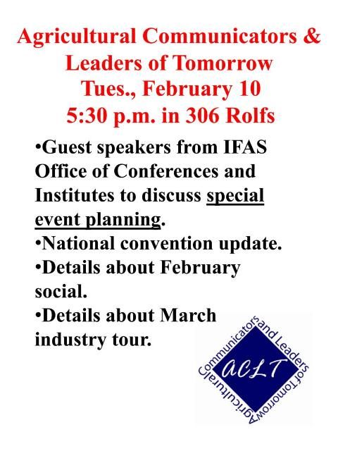
Fliers are small posters, usually placed on bulletin boards and typically used as advertisements. They are often printed on a single sheet of paper or smaller, and are intended for wide distribution. The same concepts used to develop posters are applicable to fliers. However, because fliers are smaller than posters, not as much content can be included on fliers and the images and text must be smaller. To make your flier stand out, you must emphasize what is most important in order to grab people's attention. For example, if you are designing a flier to announce that an organization is going to hold a meeting next week, you may want to place the name of an organization at the top, to include a large photograph, or to begin by saying "FREE FOOD WILL BE PROVIDED." Then fill in with other information, such as the date, time, and location of the organization's meeting.

You can use computer slide-making software such as Microsoft's PowerPoint and Apple's Keynote to create posters and fliers. In either software program, you can go to File > Page Setup and create the custom size of the poster. Then start laying out the poster. Again, make sure that the images you insert are 300 ppi so that when you print the flier, the image will not be pixilated.