This publication on developing visual elements (colors, images, navigation, and links) on the web is the fourth of a four-part series on writing and designing for the web. This series also covers how to write and design a basic Web page, understand the difference between good and bad websites, and integrate the basics of HTML.
Web Colors
Colors on the web are formed on your computer display monitor using a six-number system called a hexadecimal color number. This formula converts the colors your computer monitor displays to mathematical equivalents of other colors. You can use any color you want in an HTML page, but there is a standard 216 color palette that offers a choice of colors that will appear unchanged on almost any computer platform (PC or Macintosh) or browser (Chrome, Firefox, Safari, and others). The system color palettes in Windows for the PC and the Mac are quite different, and this discrepancy occurs with many other computer systems too. The 216 web safe colors display the same way on any monitor system. High-end monitors used for graphic design and video editing are able to display richer colors and more of the color gamut. Monitors can also be calibrated and profiled to ensure a color’s universal appearance.
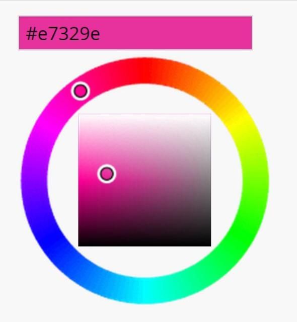
The hexadecimal color designation for black is #000000 and for white is #FFFFFF. There are charts that show the hexadecimal values for specific colors. Web-editing programs let you pick colors visually, so you do not need to remember all of them (see Figure 1). If you want to match a specific color on a button to a banner you are adding to a page, you may need to use the specific hexadecimal values, since your eye is not sensitive enough to see the difference. You can insert the hexadecimal color by typing in the values in an HTML editor or inserting the color as part of an HTML tag.

Credit: WordPress
Images and the Web
Three specific image file formats are typically displayed in a web browser:
- GIF (Graphics Interchange Format) is a graphics format that is highly compressible and includes an 8 bit (256 colors) color palette. GIFs are used primarily for line art and for animated graphics. GIFs can be animated, but JPEGs (see below) cannot be animated. Photographs should not be saved in GIF format.
- JPEG (Joint Photographic Experts Group) is a format most frequently used for photos. It is not as good for flat colors and line art drawings. It is the most common photo format for the Web and uses a 32-bit color palette, which translates to more than 16 million colors.
- PNG (Portable Network Graphic) is a public domain graphic. This is a widely used format for all types of graphics and retains transparency.
- SVG (Scalable Vector Graphic) is a web-friendly vector image that allows the graphic to be scaled without loss of quality. This format is commonly used to for logos.
On the Web, where small file sizes are important, compression is used to reduce image files down to manageable sizes. GIFs have lossless compression, which means the original information is retained as the file is compressed by an algorithm on a line-by-line basis. Lossless compression is required for simple graphics, text, and data files. JPEGs use lossy compression, during which file information is lost after it is compressed. Lossy compression is used commonly to compress multimedia data (audio, video, photographs). Some designers advise keeping individual graphics under 70 kilobits each. Images you want to use in other file formats must first be converted to a web file format using either a web editor or an image editor, such as Adobe Photoshop.
For more on photographic editing and file formats, refer to the EDIS publication #WC094 Digital Photography and Photographic Editing (https://edis.ifas.ufl.edu/wc094).
Navigation
Navigation is an important element the user interface (UI) and can contribute to a positive user experience (UX). Navigation is how your users get around the pages that make up the site to find information. Over time, certain elements have evolved as efficient techniques for getting users to move from one page to the next. A splash page, for example, is an opening, attention-getting page with graphics that either automatically refreshes to your home page or is clickable. You can use these tips to help people navigate your pages more easily:
- Buttons, which can be made as images, can be inserted on your page or into a table as navigation aids.
- You can set up table cells and fill the table cell with color and text to create clickable areas to navigate to another page.
- You can use small images, known as icons, which you then make clickable as links. Make sure you use BORDER = 0 to remove the link border.
- You can create rollovers. A rollover is a button that changes to another image—sometimes a different color of the same button—when a mouse rolls over the image. This draws attention to the button and helps the user navigate to another page.
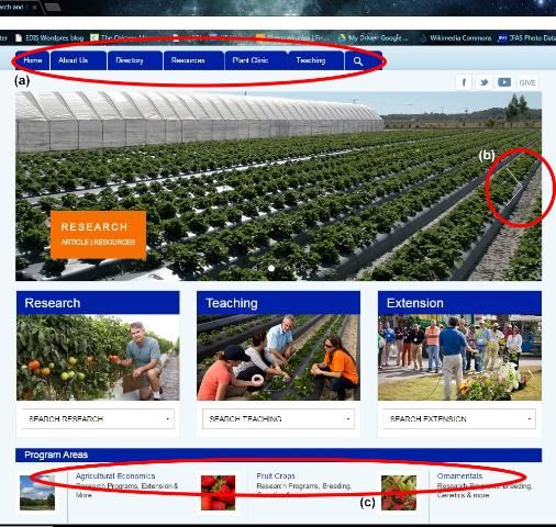
Whatever you use for navigation, it is strongly recom- mended that your navigation be consistent on all pages. For example, if your navigation buttons are at the top of your home page, your other web pages should have the navigation buttons at the same location at the top of subsequent pages. Most navigation bars are found at the tops or bottoms of Web pages. You should have links to all of your pages, including your home page, on your navigation bars on all pages. You may want to include a list of links to your pages in very small typeface at the bottom of your home page.
Additionally, you want to ensure that your navigation is easy to use when viewing the website on a mobile device. Most websites should include a scalable version of the site and navigation for mobile devices.

Credit: UF/IFAS Gulf Coast Research and Education Center homepage
Another way to use a line of navigation buttons is to create one button image that stretches across the page and to make an image map. An image map lets you link parts of an image to different links. If you see a map of the United States and can click on separate states, an image map was used to create that graphic.
Links
Web pages can include several types of links. Links connect to other pages or to other elements in a page. When text is used as a link, a highlighted underline is the default way to indicate the presence of a link. Images can also be used to link to other pages. Common types of links include
- internal links, which link from one page to another within a site;
- external links, which link from one page in a site to a page in another site;
- anchors and targets, which link from one part of a web page to another part of the same page
- object links, which are graphic objects that are also a link;
- text links, which are text that, when highlighted, indi cates a link; and
- Mail-to, which is a link that opens up an e-mail message window.
Linking is interactive and important in terms of users' evaluations of your site. Here are some ways to use linking:
- lncluding a "mail-to" link (for e-mail) that a user can click on to request more information;
- linking to an online poll or survey;
- linking to an online form to allow a user to leave feedback or to request information; or
- linking to a bulletin board discussion forum.
Reference
Telg, R. & Irani, T.A. (2012). Agricultural communications in action: A hands-on approach. Delmar: Clifton Park, NY.